

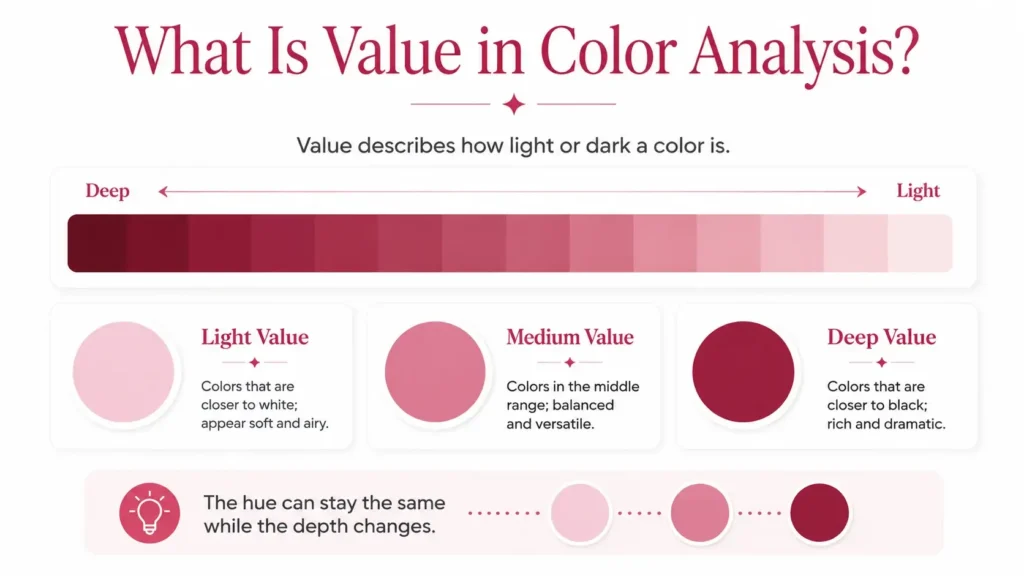
Value, also called depth, tells you how light or dark a color is.
Consider it as a scale. White sits at the light end, black sits at the deep end, and every color falls somewhere between them. In the Munsell color system, value runs from 0 for black to 10 for white.
In personal color analysis, value helps explain why two shades from the same color family can work very differently with your coloring. A pale blue, medium blue, and deep navy are all blue, but their depth changes the relationship they create with your skin, hair, and eyes.
Table of Contents
What Is Value in Color Analysis?
Value describes lightness and darkness.
- A light-value color sits closer to white. Like pale blue, light peach, lavender, soft beige, or a very light green.
- A deep-value color sits closer to black. Like navy, burgundy, forest green, charcoal, dark brown, or deep plum.
Between the two is a wide medium range, where many everyday clothing colors sit.
The important point is that value is not the same as the color itself. Blue can be light, medium, or deep. So can red, green, purple, and most other hues.
Value, Hue, and Chroma Are Different
To understand depth properly, it helps to separate three parts of color.
- Hue is the color family, such as red, blue, yellow, or green.
- Value is how light or deep the color is.
- Chroma is how clear, strong, or soft the color is.
Munsell’s color system also separates color into these three qualities, which is useful because changing one does not automatically change the others.
For example, a color can be:
Light and soft
Light and clear
Medium and soft
Medium and clear
Deep and soft
Deep and clear
That is why saying a color is simply “light” or “dark” does not tell you everything about it.
Chroma can also affect how light a color seems to your eye. More saturated colors can appear brighter than softer colors even when their measured lightness is similar.
Different Hues Behave Differently at Different Values
Not every hue reaches its strongest color at the same depth.
Yellow tends to reach stronger chroma at a lighter value, while purple-blue can reach stronger chroma much deeper on the value scale. This is one reason a deep yellow often starts reading more like mustard, olive, or brown rather than a darker version of bright yellow.
Very light and very deep colors also have less room for strong chroma than colors closer to the middle of the value range.
So value and chroma affect each other visually, even though they describe different qualities.
An easy way to check value
Try looking at a color in grayscale.
Once the color information is removed, differences in lightness become much easier to compare. It can be useful when two colors seem equally deep but their hues or chroma are distracting your eye.
Use it as a comparison tool rather than an exact measurement, since screens, cameras, lighting, and image processing can affect the result.
Why Does Value Matter in Personal Color Analysis?
Personal color analysis looks at how color qualities relate to your natural coloring.
For value, the question is simple:
How much lightness or depth creates a harmonious relationship with your coloring?
Some people connect easily with lighter shades. Others connect more strongly with deep shades. Many fall somewhere in the middle.
The goal is not to decide which colors you are allowed to wear. Value simply gives you another way to understand why some levels of depth feel more connected to your coloring than others.
And value never works alone.
A deep shade is not automatically a Deep Winter color. A light shade is not automatically Light Spring. Temperature and chroma still matter.
How to Determine Your Natural Value
Start with your coloring as a whole.
Your skin, hair, and eyes all contribute to the overall depth you see, but one feature should not decide the answer.
Light skin does not automatically mean light value. Deeper skin does not automatically mean deep value. Dark hair or eyes do not automatically place someone in a deep season either.
Look at the full combination first.
Then compare actual colors near your face.
Try light, medium, and deep shades under similar lighting. Keep the other color qualities reasonably close so depth is the main difference you are testing.
Ask yourself:
- Do light shades feel connected to your coloring, or do you prefer more depth?
- Do very deep shades feel natural, or do they create more contrast than you want?
- Does the middle of the value scale feel easier than either extreme?
- Does black work well near your face, or do you prefer dark navy, brown, charcoal, or another softer dark neutral?
- Do very pale shades work well, or do you prefer light colors with a little more depth?
Compare several colors before reaching a conclusion.
Black alone is not a perfect depth test. It sits at the deepest end of the value scale, but it is also achromatic and creates strong contrast. Your response to black can involve more than value.
Value and Contrast Are Not the Same
This distinction matters.
- Value describes how light or deep something is.
- Contrast describes the difference between lighter and deeper areas.
Someone can have light overall coloring and still have noticeable contrast between their features. Someone else can have deeper overall coloring with fairly close values across the skin, hair, and eyes.
So high contrast does not automatically mean deep value, and low contrast does not automatically mean light value.
Treat contrast as its own part of the analysis.
Light, Medium, and Deep Value
Value works on a range rather than in two fixed groups.
Light Value
Light colors sit closer to white.
It includes pale blues, soft pinks, light peach, lavender, light beige, cream, and other high-value shades.
Someone whose coloring relates strongly to light value may find that a palette built mostly from lighter and medium-light colors creates a natural connection.
Medium Value
Medium colors sit around the center of the scale.
Like medium denim, camel, rose, teal, medium green, and many olives.
A lot of people use this range easily because it sits between the two extremes. Medium colors can also connect light and deep pieces within the same outfit.
Deep Value
Deep colors sit closer to black.
Navy, burgundy, forest green, charcoal, dark brown, deep teal, and plum are common examples.
Someone who relates strongly to depth may use these shades close to the face without the color feeling separate from their natural coloring.
Which Color Seasons Are Light or Deep?
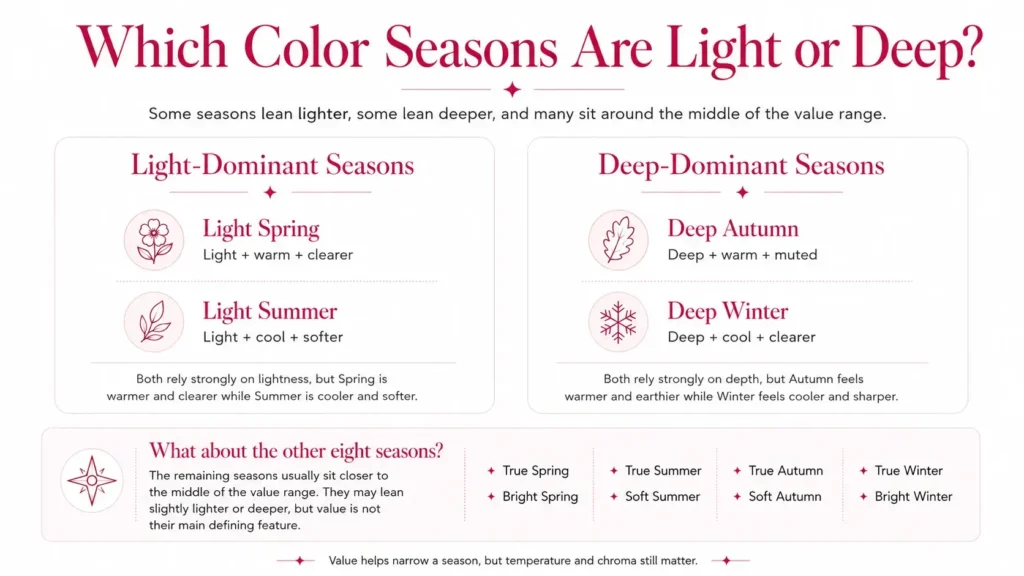
In the common 12-season system, four seasons place lightness or depth at the front of the palette.
- Light Spring and Light Summer both rely strongly on lightness, but they do not use the same colors. Spring moves warmer and clearer, while Summer moves cooler and softer.
- Deep Autumn and Deep Winter share depth. Autumn moves warmer and more muted, while Winter moves cooler and clearer.
The remaining eight seasons sit closer to the middle of the value range, although their exact position changes slightly between seasonal systems.
- True Spring and Bright Spring usually sit around light to medium values.
- True Summer and Soft Summer generally stay around light to medium.
- True Autumn and Soft Autumn move through medium to deeper territory.
- True Winter and Bright Winter often use medium to deeper values, with clarity and contrast playing an important role.
Value can therefore help narrow down a season, but it cannot determine your season by itself.
How Value and Chroma Work Together
Pairing value with chroma gives you a much better description of a color.
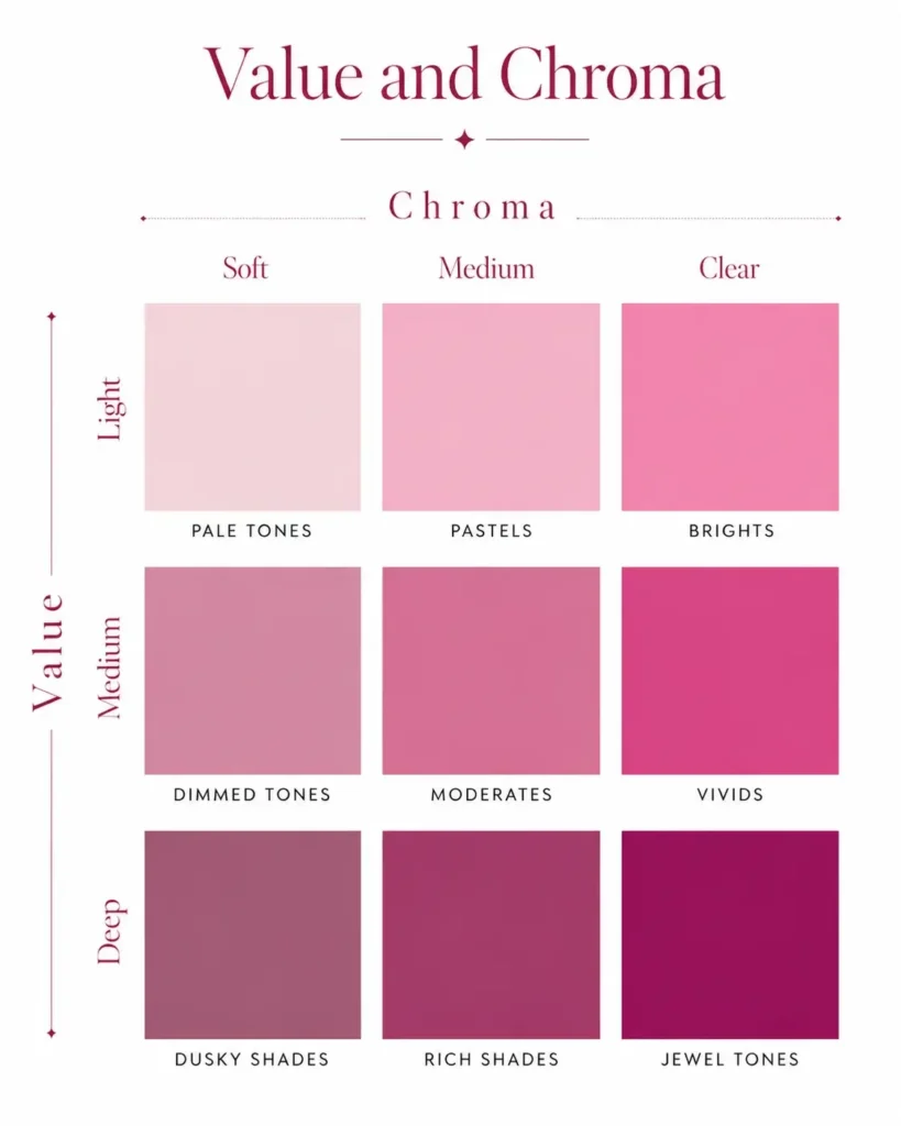
One useful framework divides color into nine groups:
| Value | Soft Chroma | Medium Chroma | Clear Chroma |
|---|---|---|---|
| Light | Pale Tones | Pastels | Brights |
| Medium | Dimmed Tones | Moderates | Vivids |
| Deep | Dusky Shades | Rich Shades | Jewel Tones |
Pale Tones
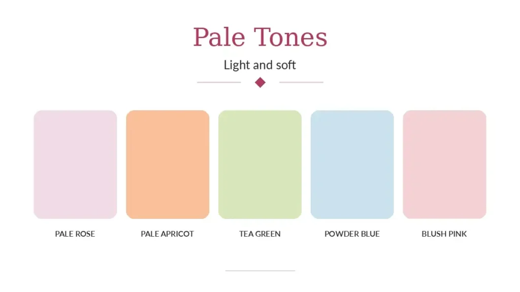
Light and soft.
Like ecru, pale heather gray, faded blush, or a very soft blue.
Pale tones contain only a small amount of visible color compared with stronger light shades.
Pastels
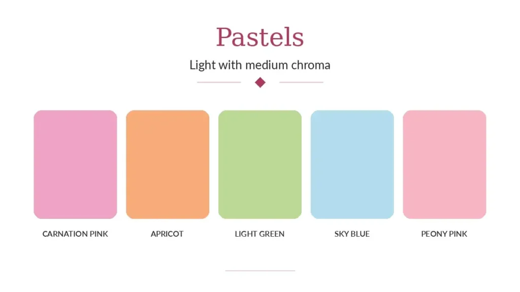
Light with medium chroma.
Like pistachio, peach, lavender, or soft aqua.
Pastels have more color presence than pale tones, which is why the two groups should not be treated as the same thing.
Brights
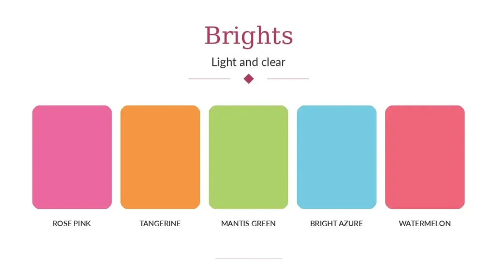
Light and clear.
Strong yellows and oranges often fall into this area because these hues can hold high chroma at lighter values.
Dimmed Tones
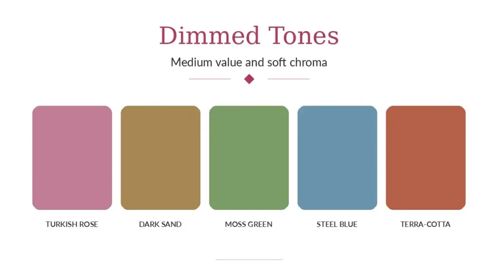
Medium in value and soft in chroma.
Stonewashed denim, khaki, muted blue, and some olives are good examples.
Moderates
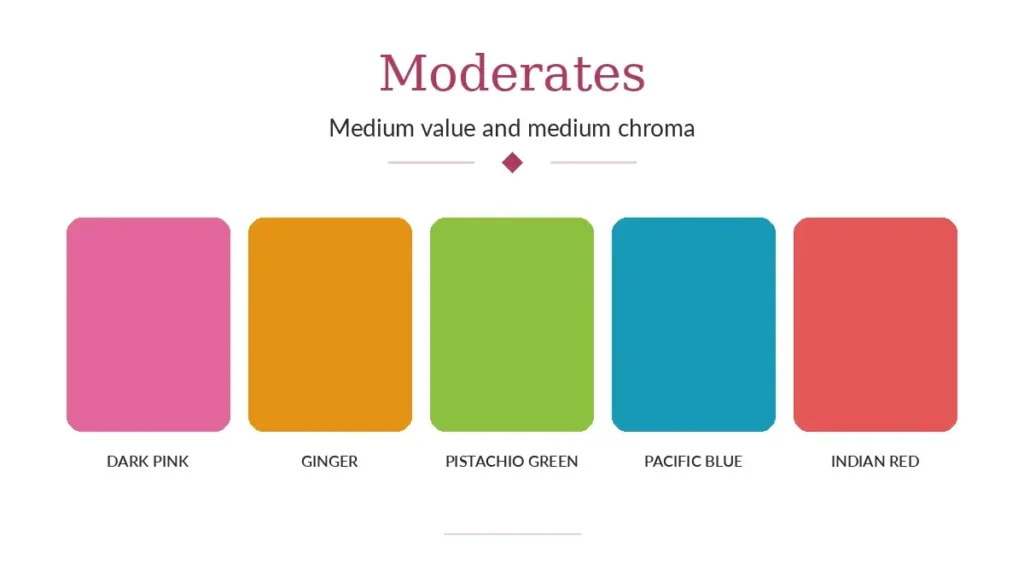
Medium in both value and chroma.
They sit between very soft and very clear colors, with neither quality dominating.
Vivids
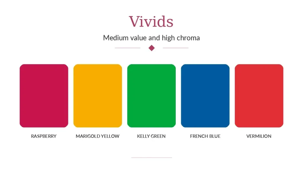
Medium in value and high in chroma.
Clear red, strong blue, hot pink, and other highly saturated medium-depth colors fit here.
Dusky Shades
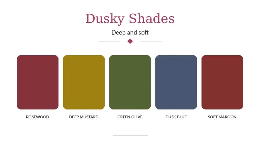
Deep and soft.
Like smoky blue, deep taupe, gray-brown, or muted dark green.
They have depth without strong chroma.
Rich Shades
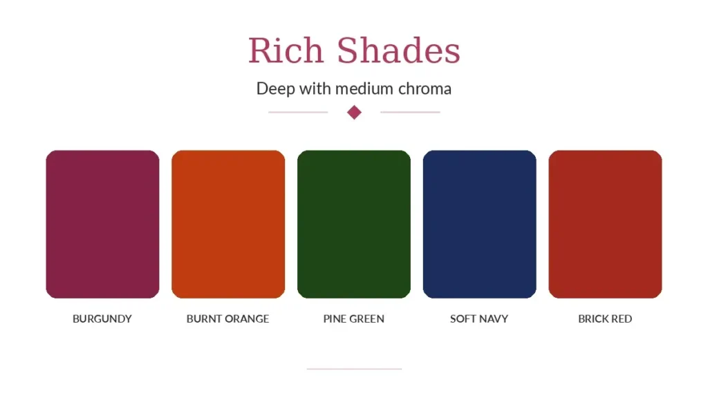
Deep with medium chroma.
Burgundy, dark eggplant, deep teal, and many dark browns fit here.
Jewel Tones
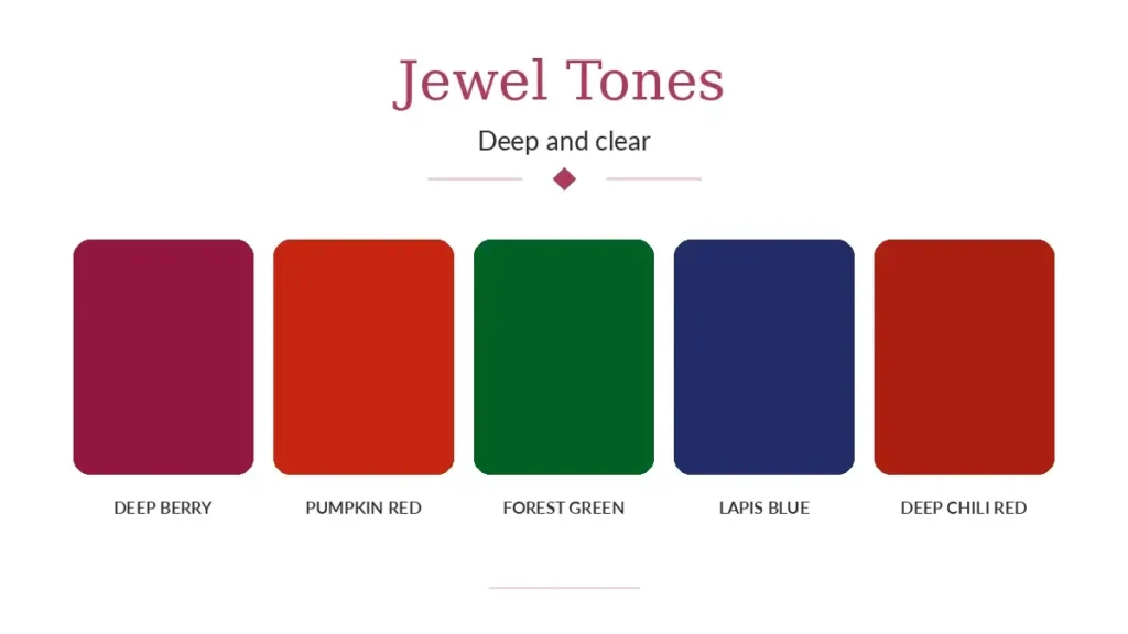
Deep and clear.
Emerald, sapphire blue, ruby red, and deep clear purple are common examples.
The grid shows why two light colors or two deep colors can still behave very differently.
A pale gray and a clear yellow may both be light, but their chroma is far apart. A smoky olive and a clear sapphire may both be deep, but they create very different color relationships.
What About Black and White?
Black and white form the two ends of the value scale.
Technically, they are achromatic. They do not have a hue, and neutral colors sit at zero chroma in the Munsell system.
That makes them useful for understanding depth, but they are not perfect substitutes for every light or deep color.
You might connect well with deep navy but not black. Or you may prefer ivory, pale beige, or soft gray to pure white.
That can happen because value is only one part of the color.
How to Use Value in Your Wardrobe
Once you have a sense of your value range, start with clothing near your face.
Tops, jackets, scarves, collars, and similar pieces have the strongest direct relationship with your coloring.
Then think about the rest of the outfit.
- A light top with dark trousers creates strong value contrast.
- A medium top with medium trousers creates much less.
- A deep outfit with a small light accent creates another type of value pattern.
None of these combinations is automatically better. They simply use value differently.
The same idea applies to makeup and accessories.
A pale pink lip color, medium rose, and deep berry may have a similar temperature but very different depths. Jewelry, glasses, bags, belts, and other accessories can also add lighter or deeper points to an outfit.
Value Is a Range, Not a Rule
You do not need to reduce your coloring to either “light” or “deep.”
A better question is:
Which part of the value scale creates the kind of color harmony I like with my coloring?
For some people, value is one of the clearest parts of their color profile. For others, temperature or chroma matters more.
You may also enjoy several value ranges rather than one narrow group.
That is the point of understanding depth. It gives you more information about a color, not another rule to follow.
Once you can separate lightness from hue and chroma, colors become much easier to compare. A blue is no longer just blue. It can be pale or deep, soft or clear, and each version creates a different relationship with the rest of your palette.