

You can know your undertone, know your season, and still feel confused by color.
Maybe warm colors are supposed to suit you, but bright coral looks too loud. Maybe blue is in your palette, but cobalt feels sharp while dusty blue feels calm and natural. Or maybe muted colors make someone else look soft and put together, but on you they look flat.
That is where chroma comes in.
Chroma is one of the most useful parts of color analysis because it explains the intensity of a color. It tells you whether a color is bright and clear, or soft and muted. Once you understand chroma, it becomes easier to see why two colors from the same color family can look completely different on your face.
- A red can be clear and bold.
- A red can be dusty and soft.
- A red can be warm, cool, light, dark, bright, or muted.
Chroma helps you understand that difference.
Table of Contents
What Is Chroma in Color Analysis?
Chroma means the intensity, purity, or clarity of a color.
In simple words, chroma tells you how bright or dull a color looks.
A high chroma color looks clear, rich, and vivid. It has very little gray mixed into it. Like cobalt blue, apple red, emerald green, hot pink, bright white, sunny yellow, or clear coral.
A low chroma color looks softer, dustier, or more muted. It has a grayed or softened quality. Like dusty rose, sage green, mauve, olive, soft teal, warm taupe, muted peach, dusty denim, or soft plum.
The easiest way to understand chroma is to compare two colors from the same family.
Cobalt blue and dusty blue are both blue, but they do not have the same chroma. Cobalt blue is bright and clear. Dusty blue is softer and more muted.
Fire-engine red and brick red are both red, but fire-engine red has higher chroma. Brick red is more muted.
Bright coral and muted peach can both feel warm, but one is much clearer and stronger while the other is softer and calmer.
That is chroma.
It is not about whether a color is warm or cool. It is not about if a color is light or dark and how pure, clear, bright, or muted the color looks.
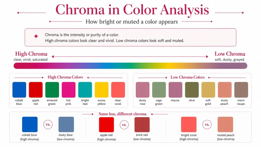
Chroma vs. Saturation, Hue, Value, and Contrast
Color words can get confusing fast, so let’s keep this simple.
Chroma vs. Saturation
Chroma and saturation are closely related. In everyday color analysis, people often use them in a similar way.
Both describe how intense or pure a color looks.
A highly saturated color usually has high chroma. A desaturated color usually has low chroma.
The small difference is that saturation is often used in digital color settings, photography, and design. Chroma is often used when talking about color purity and how much grayness a color has.
You can think of chroma as the color’s intensity level.
- Clear, vivid, strong color means high chroma.
- Soft, dusty, grayed color means low chroma.
Chroma vs. Hue
Hue is the color family.
Red, orange, yellow, green, blue, and purple are hues.
Chroma tells you what type of red, blue, green, or purple you are looking at.
For example:
- Bright red is high chroma
- Brick red is medium to low chroma
- Dusty rose is low chroma
- Burgundy can be clear or muted depending on the exact shade
That is why shopping by hue alone does not always work. Someone may say red suits you, but that does not mean every red will suit you.
You may need a clear red, a muted red, a warm red, or a deeper red. Chroma helps narrow it down.
Chroma vs. Value
Value means how light or dark a color is.
Chroma means how bright or muted it is.
A color can be light and high chroma, like bright yellow.
A color can be dark and high chroma, like emerald green.
A color can be light and low chroma, like soft dove gray or dusty lavender.
A color can be dark and low chroma, like olive or muted berry.
So, value and chroma are not the same thing.
Value is about lightness and darkness. Chroma is about clarity and softness.
Chroma vs. Contrast
Contrast is the difference between colors or features.
In personal color analysis, contrast often means the difference between your hair, skin, and eyes.
Chroma is about intensity.
They can work together, but they are not the same.
Someone with very high contrast may often suit clearer colors, but not always. Someone with softer contrast may often suit muted colors, but again, the full answer depends on undertone, value, and season too.
The point is this: contrast shows difference. Chroma shows intensity.
What Are High Chroma Colors?
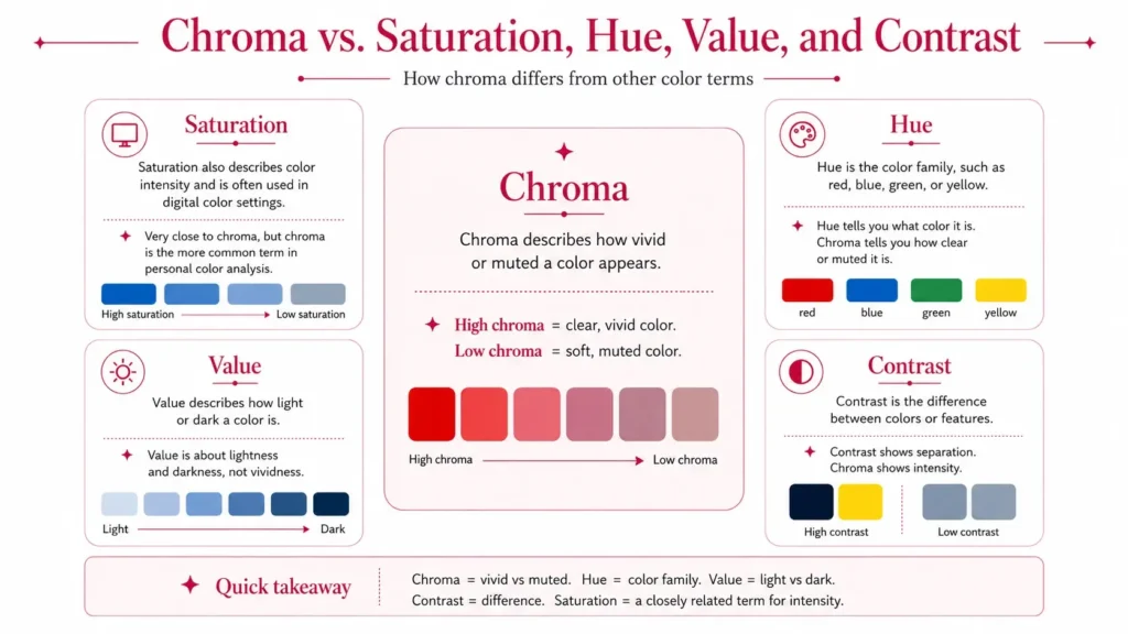
High chroma colors are bright, clear, vivid, and strong.
They look clean rather than dusty. They feel fresh rather than faded. They hold attention because the color itself is pure and clear.
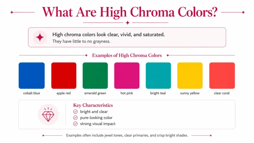
Examples of high chroma colors include:
- Cobalt blue
- Apple red
- Spring green
- Electric blue
- Hot pink
- Bright white
- Clear coral
- Bright teal
- Sunny yellow
- Emerald
- Sapphire
- Ruby
- Fuchsia
High chroma colors are not always neon. This is a common mistake.
Neon colors are very intense, but high chroma can also include clean jewel tones, clear primary colors, and bright seasonal shades that are strong without looking fluorescent.
A high chroma red, for example, can be a clean apple red or a clear cherry red. It does not have to look like a marker pen.
A high chroma and medium value red is a good example. It is not very pale. It is not very dark. It sits somewhere in the middle for lightness, but its color strength is clear and vivid.
That is why chroma and value need to be read separately.
What Are Low Chroma Colors?
Muted colors are low chroma colors.
They look softer because the color has been toned down. Many muted colors look like they have a little gray, brown, taupe, or softness mixed into them.
Muted does not mean ugly or boring.
Muted simply means the color is less vivid.
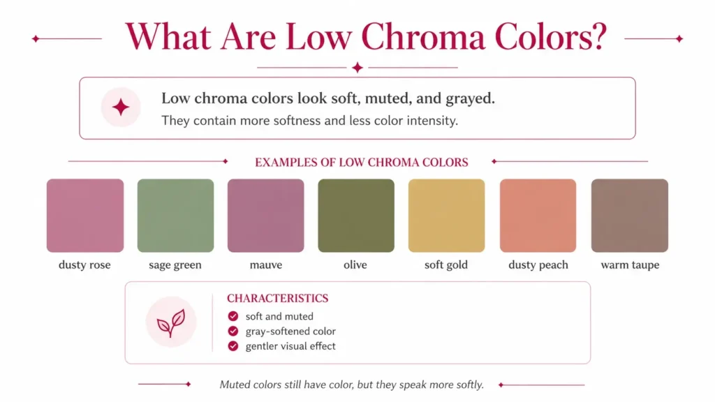
Examples of muted colors include:
- Dusty rose
- Sage green
- Mauve
- Dove gray
- Olive
- Soft gold
- Dusty peach
- Muted rose
- Taupe
- Dusty lavender
- Soft teal
- Warm taupe
- Mushroom taupe
- Soft terracotta
- Muted peach
- Dusty denim
- Soft plum
- Muted berry
A muted color palette often feels calm, soft, and easy to wear. It can look very natural on someone whose features are also soft and blended.
A true muted color palette is not just a random group of beige and gray shades. It still has color. The difference is that the color is softened.
- Muted red may show up as brick red, rosewood, muted berry, or soft terracotta.
- Muted green may show up as sage, olive, moss, or eucalyptus.
- Muted blue may show up as dusty denim, slate blue, soft navy, or blue-gray.
Muted colors still have personality. They just speak more softly.
What Does Chroma Have to Do with Skin?
Your natural coloring has a chroma level too.
When people talk about skin chroma or chroma in skin, they usually mean how clear, vivid, soft, muted, bright, or blended your overall coloring appears.
It includes your skin, hair, and eyes together.
High chroma features often look clear and defined. The eyes may look bright or sharp. The skin may have a clean, fresh look. The hair color may feel strong or clear rather than smoky or blended.
Low chroma features often look softer and more blended. The hair, skin, and eyes may flow together gently. The eyes may have mixed tones, such as hazel, gray-blue, soft green, or muted brown. The hair may have a soft ash, beige, brown, or golden quality rather than one very clear shade.
This is why chroma matters so much in personal color analysis.
- If your features are high chroma, dusty colors may make you look tired or flat.
- If your features are low chroma, bright colors may overpower your face.
The goal is not to force yourself into trendy colors but to match the color’s intensity to your own natural coloring.
High Chroma Coloring: Bright and Clear
High chroma coloring has a clear quality.
The person often looks best in colors that are vivid, crisp, and clean. These colors do not fight the face. They match the natural brightness already present in the features.
Signs you may lean high chroma:
- Your eyes look clear, bright, or sharply defined
- Your features look better in clean color than dusty color
- Grayish shades make you look tired
- Muted colors seem to disappear on you
- Bright lipstick or a clear top looks normal on you, not too loud
- Jewel tones feel better than soft washed colors
- Your face can handle strong color near it
High chroma people often suit clear versions of their best colors.
For example:
- Clear red instead of brick red
- Cobalt instead of dusty denim
- Emerald instead of sage
- Bright coral instead of muted peach
- Hot pink instead of dusty rose
- Bright white instead of soft ivory or gray beige
High chroma is common in Bright Winter and Bright Spring palettes.
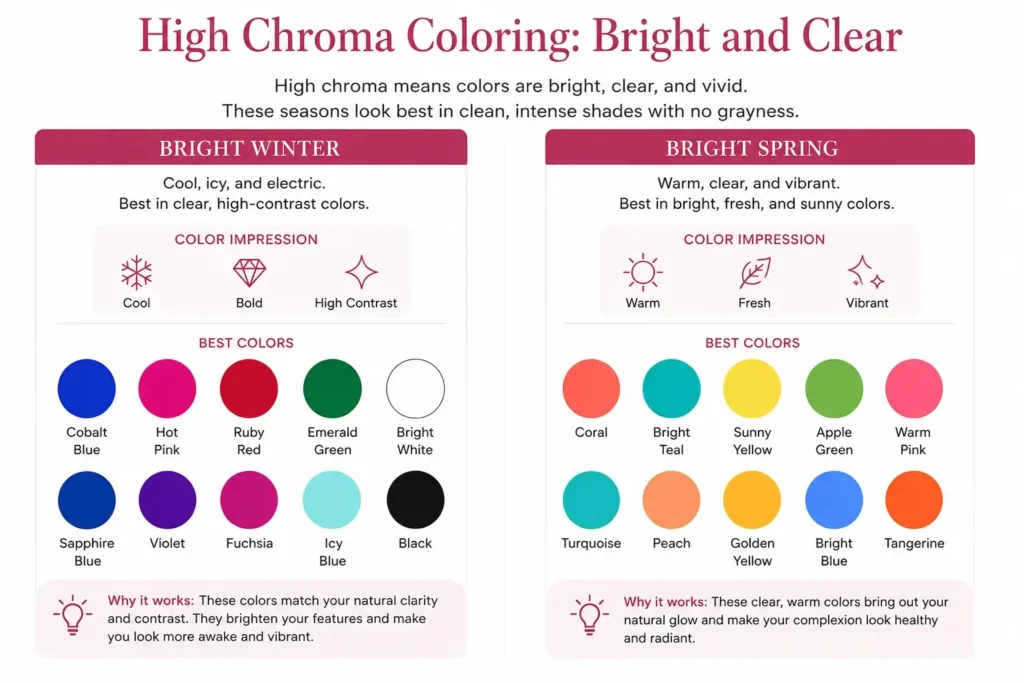
Bright Winter
Bright Winter is cool and bright.
The colors are clear, sharp, and cool leaning, like electric blue, hot pink, bright white, ruby, sapphire, and icy clear shades.
Bright Winter does not need dusty softness. It needs clarity.
A muted mauve may make Bright Winter coloring look dull, while a clear berry or bright cool pink may make the face look more awake.
Bright Spring
Bright Spring is warm and bright.
The colors are clear, warm, and lively, like coral, bright teal, sunny yellow, clear peach, apple green, and fresh turquoise.
Bright Spring needs warmth, but it also needs brightness.
A soft terracotta may feel too heavy or dusty, while a clear coral or warm bright pink may look much better.
Low Chroma Coloring: Soft and Muted
Low chroma coloring has a softer look.
The person often looks best in colors that are muted, dusty, blended, or gently grayed. These colors do not overpower the face. They match the softness already present in the features.
Signs you may lean low chroma:
- Your hair, skin, and eyes blend together softly
- Very bright colors make the outfit stand out more than your face
- Neon or electric colors feel too harsh
- Dusty rose, sage, mauve, taupe, or soft teal look natural on you
- Your best makeup shades are softened rather than clear
- Black and bright white may feel too strong
- You look better in calm color than sharp color
Low chroma does not mean colorless. It means softened color.
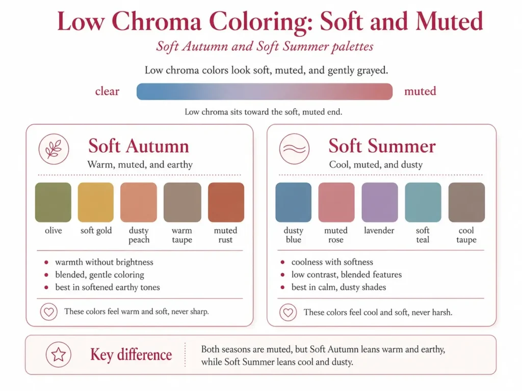
This is common in Soft Autumn and Soft Summer palettes.
Soft Autumn
Soft Autumn is warm and muted.
The colors are warm, earthy, and softened, like olive, soft gold, dusty peach, warm taupe, muted coral, moss, camel, soft terracotta, and muted rust.
Soft Autumn often has warm, blended features. The face may look calm and balanced in colors that have warmth without too much brightness.
Bright orange may overpower Soft Autumn, but muted peach or soft terracotta can feel much more natural.
Soft Summer
Soft Summer is cool and muted.
The colors are cool, dusty, and soft, like dusty blue, lavender, muted rose, soft plum, blue-gray, mauve, dusty pink, and soft teal.
Soft Summer often has a gentle, blended look. The features may not need sharp contrast or bright color.
Hot pink may feel too strong, while muted rose or dusty lavender may make the face look softer and clearer.
What About Medium Chroma?
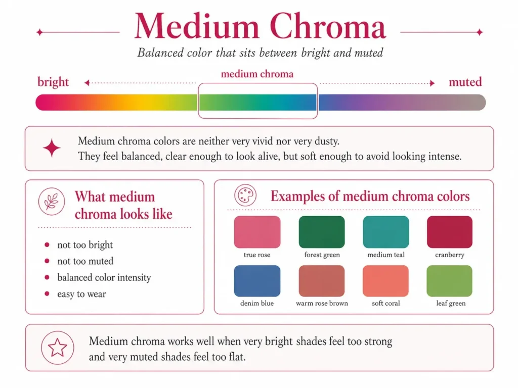
Not everyone is strongly bright or strongly muted.
Many people sit in the middle.
Medium chroma colors are neither very clear nor very dusty. They have enough color to feel alive, but not so much that they look electric.
Medium chroma can include shades like:
- True rose
- Forest green
- Medium teal
- Cranberry
- Denim blue
- Warm rose brown
- Soft but not dusty coral
- Clear but not neon green
Medium chroma people usually have some room to wear both sides, but extremes can still look off.
Very bright colors may feel too loud.
Very muted colors may feel too flat.
In seasonal color analysis, many seasons sit around the middle rather than the far ends. True Summer, Light Summer, True Autumn, and Deep Autumn often lean softer. True Winter, Deep Winter, True Spring, and Light Spring often lean clearer. Still, each person needs to be read as a whole.
Warm Muted Color Palette: What It Looks Like
A warm muted color palette is low chroma with warmth.
The colors are not icy, sharp, or electric. They are also not plain gray. They have warmth, but the warmth is softened.
Good examples include:
- Olive green
- Moss
- Soft gold
- Muted peach
- Warm taupe
- Camel
- Soft terracotta
- Muted rust
- Dusty coral
- Warm beige
- Mushroom brown
- Muted apricot
- Brick red
- Rosewood
- Soft bronze
This type of palette often works well for people who look warm but not bright.
That detail matters.
A warm person may still look wrong in bright orange, clear yellow, or vivid coral if their chroma is soft. The warmth may be right, but the intensity may be too high.
For that person, muted peach, soft gold, olive, or warm taupe may look far better.
This is why undertone alone is not enough.
Clear Chroma vs. Muted Chroma
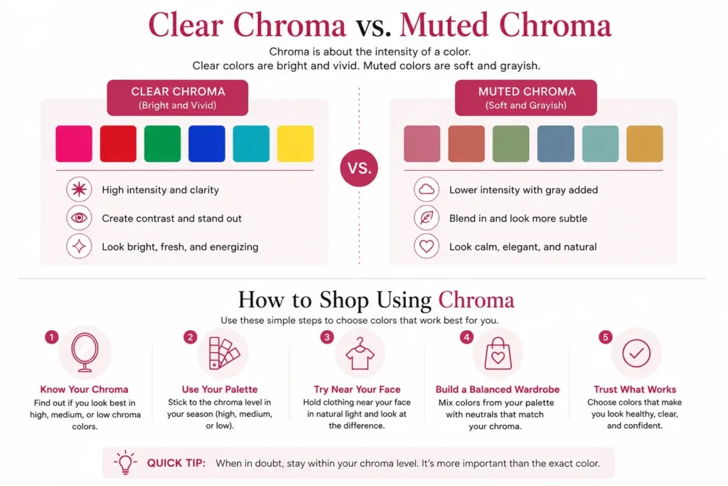
Clear chroma (high chroma) means the color looks clean and vivid.
Muted chroma (low chroma) means the color looks softened and grayed.
Here are simple comparisons:
- Clear blue: cobalt
- Muted blue: dusty denim
- Clear green: emerald
- Muted green: sage
- Clear red: apple red
- Muted red: brick red
- Clear pink: hot pink
- Muted pink: dusty rose
- Clear coral: bright coral
- Muted coral: muted peach
- Clear purple: violet
- Muted purple: soft plum
The hue family may be similar, but the chroma changes the whole effect.
That is why two people can both wear green, but one needs emerald while the other needs sage.
How to Find Your Chroma at Home
You do not need special tools to start seeing chroma. You just need a mirror, natural light, and a few clothing items.
1. Test the Same Hue Family
Pick two colors from the same family, but with different intensity.
Try:
- Cobalt blue vs dusty denim
- Bright coral vs muted peach
- Apple red vs brick red
- Emerald green vs sage green
- Hot pink vs dusty rose
Hold each color under your chin, one at a time.
Do not focus on whether you like the color. Focus on what happens to your face.
Ask:
- Does my skin look clearer or more uneven?
- Do my eyes look brighter or duller?
- Does the color support my face or steal attention?
- Do I look fresh or tired?
- Does the shade feel natural or forced?
2. Use Natural Light
Stand near a window during the day.
Avoid strong yellow indoor lighting because it can change how colors look. Also avoid heavy makeup for this test. Makeup can add artificial contrast and intensity, which may confuse the result.
3. Take Side-by-Side Photos
Photos can help because your eye may adjust in the mirror.
Take one photo in the bright color and one in the muted color. Keep the same lighting, same angle, and same camera settings.
Then compare.
Do not ask which outfit is prettier. Ask which one makes your face look clearer.
4. Watch the Mouth, Eyes, and Skin
Wrong chroma often shows up fast.
If the color is too bright, your skin may look blotchy, your mouth may look less defined, or the color may feel like it enters the room before you do.
If the color is too muted, your face may look gray, tired, or faded.
Right chroma usually makes the face feel balanced. Your skin looks more even. Your eyes look present. The color feels like it belongs.
How to Shop Using Chroma
Once you know your chroma range, shopping gets easier.
You stop asking, Is this color in my season?
You start asking, Is this color the right intensity for me?
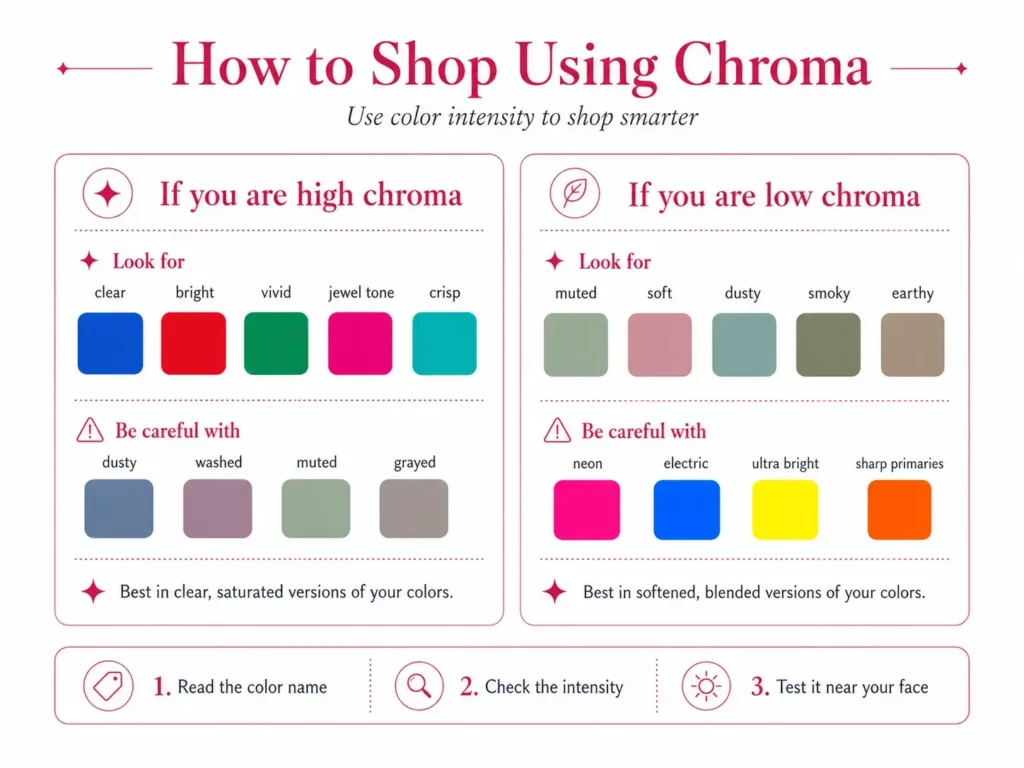
If You Are High Chroma
Look for words like:
- Clear
- Bright
- Vivid
- Crisp
- Jewel tone
- Saturated
- Clean
- True
- Electric
- Icy
Good choices may include:
- Cobalt
- Emerald
- Ruby
- Bright white
- Clear coral
- Hot pink
- Sapphire
- Bright teal
- Apple red
Be careful with:
- Dusty
- Washed
- Muted
- Grayed
- Ashy
- Soft taupe
- Muddy brown
- Faded pastels
Those shades may drain the brightness from your face.
If You Are Low Chroma
Look for words like:
- Muted
- Dusty
- Soft
- Washed
- Smoky
- Grayed
- Blended
- Earthy
- Powdery
- Gentle
Good choices may include:
- Sage
- Dusty rose
- Mauve
- Soft plum
- Muted teal
- Warm taupe
- Olive
- Dusty blue
- Soft terracotta
- Muted berry
Be careful with:
- Neon
- Electric
- Ultra bright
- Clear white
- Hot pink
- Vivid orange
- Sharp primary colors
Those shades may overpower your natural coloring.
Chroma in Art and Style
In art, chroma is used to describe how pure or intense a color is. A painter can lower the chroma of a color by mixing it with gray, brown, black, white, or its opposite color. That is how a bright red can turn into brick red, rosewood, or dusty pink.
The same idea works in clothing.
A bright color looks closer to pure pigment.
A muted color looks softened.
This is why chroma matters in both art and personal color analysis. It gives you a better way to describe color than just saying bright, dull, pretty, or not pretty.
You can say:
- This red is too high chroma for me
- This blue is too muted for my coloring
- I need warmer colors, but with lower chroma
- I can wear green, but not the clear green
- My skin looks better in soft color than vivid color
That is much more useful than just saying a color works or does not work.
Is Chroma the Same as Color Brightness?
People often use brightness in a casual way to mean chroma, but they are not always the same in technical color language.
When someone says the brightness or dullness of a color, they are usually talking about chroma in a simple way.
Bright color often means high chroma.
Dull, dusty, or muted color often means low chroma.
But brightness can also be used to talk about light, screen settings, or value. So for color analysis, chroma is the more exact word.
If you are asking, What is the bright color?, the better question is:
Is this color high chroma?
That gives you a clearer answer.
FAQs
What is color chroma?
Color chroma is the intensity or purity of a color. High chroma colors look bright and clear. Low chroma colors look soft, muted, dusty, or grayed.
What is chroma in color analysis?
In color analysis, chroma helps show whether your natural coloring suits bright clear colors or softer muted colors. It works with undertone, value, and contrast to form your best palette.
What does muted color mean?
A muted color is a low chroma color. It has been softened, often with a grayed, dusty, earthy, or blended quality. Sage, dusty rose, mauve, olive, and warm taupe are muted colors.
What is clear chroma?
Clear chroma means the color looks clean and vivid, with little grayness. Clear colors often suit people with bright, crisp, high chroma features.
What is red chroma?
Red chroma describes how clear or muted a red is. Apple red is high chroma. Brick red is more muted. Dusty rose is low chroma.
Can skin be muted?
Yes. Muted color skin usually means the overall coloring of the skin, hair, and eyes looks soft or blended rather than vivid and sharp. A person with muted coloring often suits low chroma colors.
What is a chroma scale?
A chroma scale shows colors moving from pure and vivid to soft, grayed, or neutral. In personal color analysis, it helps explain the range between bright and muted colors.
What is color volume?
Color volume is a simple way to think about chroma. High chroma feels loud and clear. Low chroma feels softer. Your best colors usually match your own natural color volume.
Final Takeaway
Chroma is the reason one red works and another red does not.
It is the reason bright coral may make one person glow while making another person look blotchy. It is the reason sage green can look soft and natural on one person, but dull on someone else.
If undertone tells you whether a color should be warm or cool, chroma tells you how intense that color should be.
- High chroma people usually need clear, vivid colors.
- Low chroma people usually need soft, muted colors.
- Medium chroma people often sit between the two and need colors that are balanced, not too electric and not too dusty.
Once you learn to see chroma, color starts making more sense. You stop buying shades that almost work and start choosing colors that match your natural intensity.