Color contrast is an easy way to understand why some outfits make your face look clear, while others make you look flat or tired.
In color analysis, contrast means the light and dark difference between your natural features. Your skin, hair, eyebrows, and eyes all have a value, which simply means how light or dark they look. When those values are far apart, you have higher contrast. When they are close together, you have lower contrast.
It is not about being better or worse. A high contrast face is not more beautiful than a low contrast face. It only tells you what kind of color mix works best near your face.
The goal is to wear colors that repeat the natural contrast in your features.
Table of Contents
What Is Contrast in Color Analysis?
Contrast in color analysis is the visible difference between light and dark areas on your face.
Look at these parts first:
Skin
Hair
Eyebrows
Eyes
Lips, if they are naturally darker or lighter than your skin
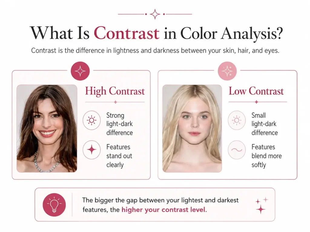
If your hair is very dark and your skin is very light, the gap is strong. That is high contrast coloring. If your hair, skin, and eyes sit close together in depth, that is low contrast coloring. If there is a clear difference, but it is not extreme, that is medium contrast.
This is also called facial contrast because you are reading the contrast in your face, not just in your clothes.
A Quick Way to Understand It
- High contrast means your features stand apart clearly.
- Medium contrast means your features have some difference, but not a sharp one.
- Low contrast means your features blend softly.
What Does It Mean to Have High Contrast Features?
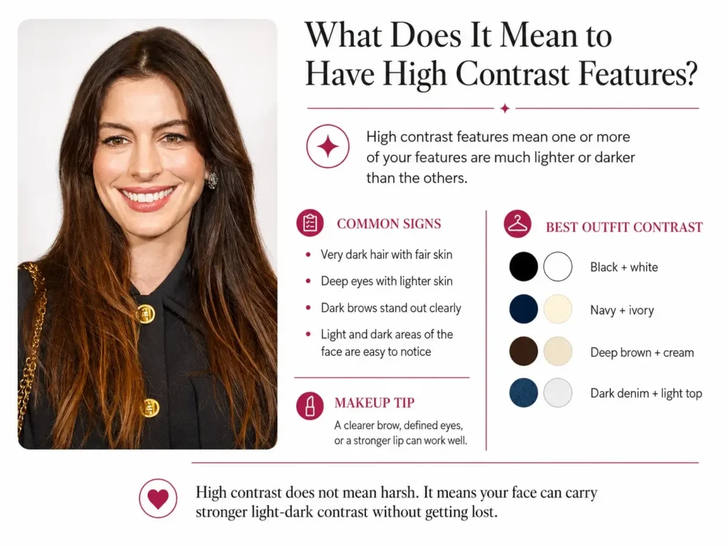
High contrast features mean one or more of your features are much lighter or darker than the others.
Common examples:
- Very dark brown or black hair with fair skin
- Deep eyes with light skin and lighter hair
- A dark brow line against pale skin
- A high contrast brunette with dark hair, dark brows, and lighter skin
A high contrast person usually looks good when their outfit has clear light and dark contrast too. For example:
- Black with white
- Navy with ivory
- Deep brown with cream
- Dark denim with a light top
- Clear prints with light and dark parts
It does not mean high contrast people must wear harsh outfits every day. It means they can usually carry stronger contrast without the clothes taking over their face.
A high contrast face is where the light and dark parts stand apart strongly.
For makeup, high contrast faces can often handle a stronger lip, a clearer brow, or more defined eye makeup. The key is to keep it clean, not heavy.
What Is Low Contrast?
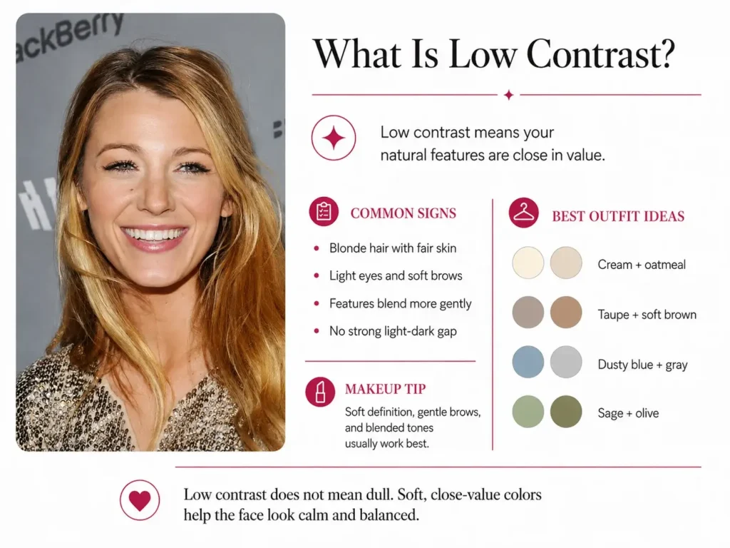
Low contrast means your natural features are close in value.
Your skin, hair, eyes, and brows may all look light, all look medium, or all look deep. The key point is that none of them creates a strong light and dark gap.
Common examples:
- Blonde hair, fair skin, and light eyes
- Medium brown hair with medium skin and brown or hazel eyes
- Soft gray hair with fair or medium skin
- Deep skin, dark hair, and dark eyes that sit close together in value
Low contrast features often look best with low contrast colors. These are colors that sit close together in lightness or darkness. A cream top with beige trousers, soft blue with gray, camel with warm brown, or olive with moss green can look calm and balanced on a low contrast person.
Good outfit ideas:
- Cream with oatmeal
- Taupe with soft brown
- Dusty blue with gray
- Sage with olive
- Camel with warm beige
- Charcoal with soft black, if your coloring is deeper
Low contrast does not mean dull. You can add interest with texture, jewelry, fabric, shape, or a small accent color. The main outfit can stay soft while one detail adds life.
What Is a Medium Contrast Face?
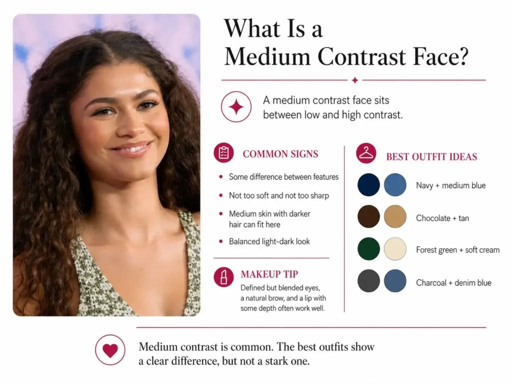
A medium contrast face sits between low and high contrast.
There is a clear difference between your features, but it is not sharp enough to look high contrast.
Common examples:
- Medium brown hair with lighter skin
- Dark blonde hair with medium brows and light eyes
- Medium skin with dark brown hair and softer eyes
- Gray or silver hair with medium or deeper eyes
Medium contrast people often look best in outfits that have a clear difference, but not a black and white level of contrast. A navy sweater with medium blue jeans may work better than black with white. A chocolate top with tan trousers may work better than black with cream. You can also try:
- Burgundy with rose brown
- Forest green with soft cream
- Charcoal with denim blue
For makeup, medium contrast usually looks best with clear but blended definition. Like defined lashes, a natural brow, and a lip color with some depth, not a very pale nude or very dark statement lip unless the rest of the face supports it.
Medium contrast is common, so do not force yourself into high or low if your features sit in the middle.
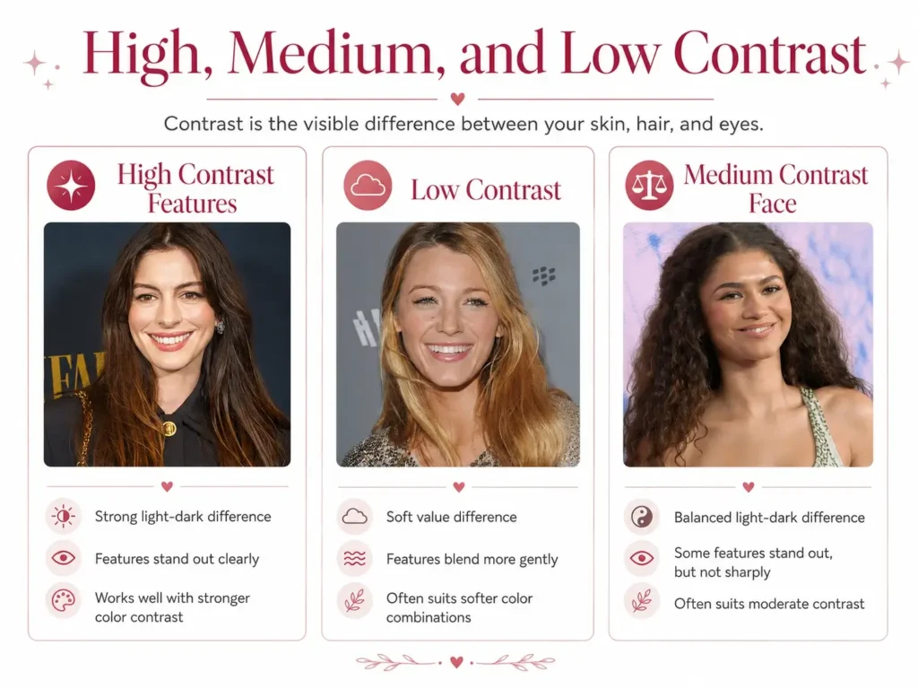
Low vs. High vs. Medium Contrast Face
Here is the clean way to compare them.
High contrast face:
Features stand apart clearly
Hair or brows may look much darker than skin
Eyes may create a strong point of depth
Looks good in outfits with strong light and dark gaps
Can wear stronger prints and clear contrast lines
Low contrast face:
Features blend more softly
Hair, skin, and eyes sit close in value
No single feature creates a strong dark or light break
Looks good in softer outfits with close values
May look better in soft prints than sharp prints
Medium contrast face:
Some features stand apart
The difference is clear but not extreme
Looks good with balanced outfits
Can wear some contrast, but too much may feel heavy
The easiest test is not, “Do I have dark hair?” The better question is, “How far apart are my lightest and darkest features?”
How To Check Your Contrast Level
You do not need a full studio setup. You need one clear photo and a few minutes.
Step 1: Take a clear face photo
Use natural daylight. Face a window if you can. Avoid strong filters, heavy makeup, and colored lighting. Pull your hair back only if it hides your natural hair depth around your face.
Step 2: Turn the photo black and white
It removes color, so you can focus on value contrast. Value means how light or dark something is.
Once the color is gone, look at your skin, hair, brows, and eyes.
Step 3: Ask what stands out
Look at the photo and ask:
Does my hair look much darker than my skin?
Do my brows stand out strongly?
Do my eyes create a dark point against my face?
Do my features mostly blend together?
Is the contrast clear, but not strong?
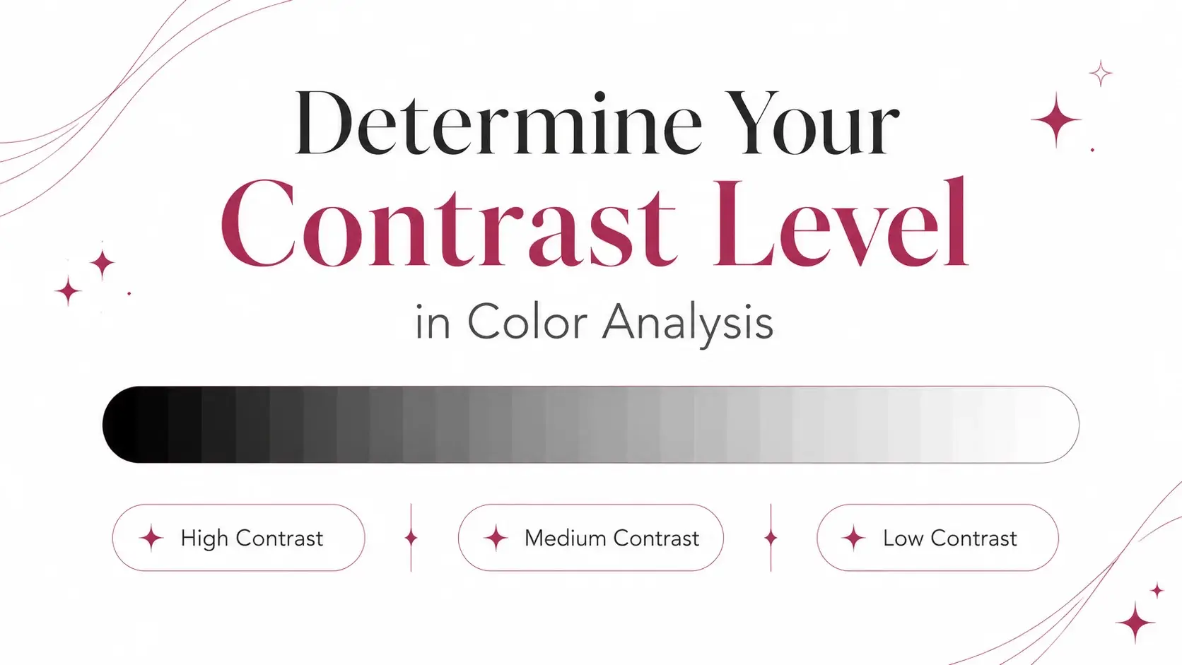
Step 4: Use a contrast scale
A contrast scale is a line from very dark to very light. You can think of it as 1 to 10:
1 is near black
5 is medium gray
10 is near white
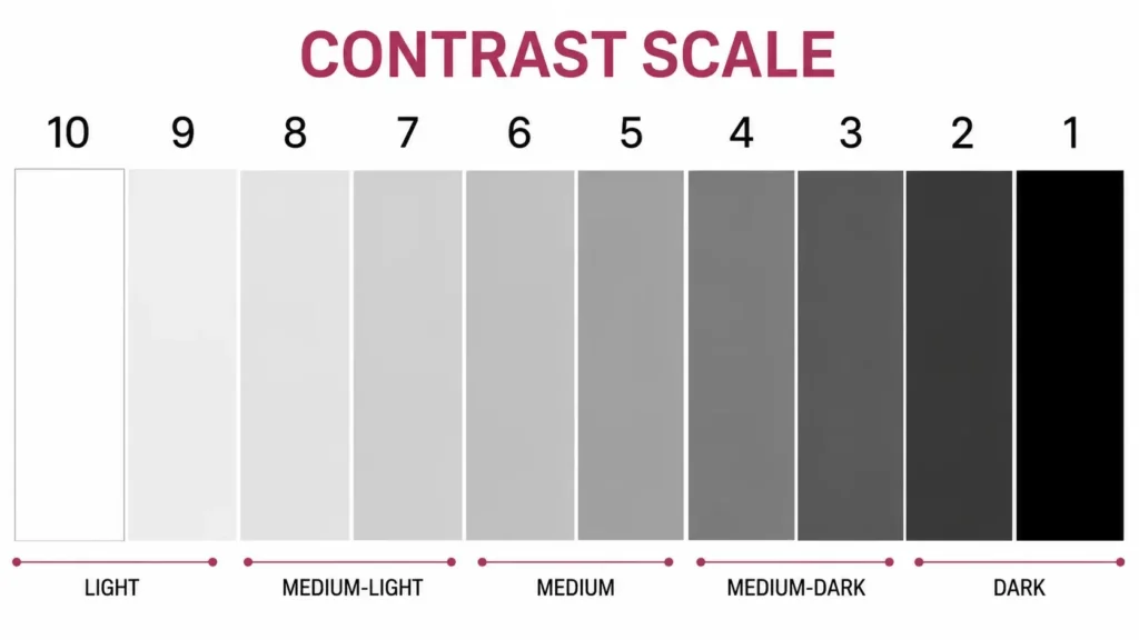
Now place your features on that scale.
Example:
Hair: 6
Skin: 8
Eyes: 5
Your lightest value is 8. Your darkest value is 5. The difference is 3. That points to low contrast.
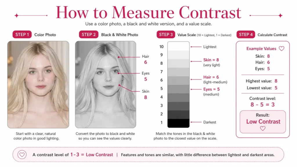
A Simple Contrast Chart
- 0 to 3 difference: Low contrast
- 4 to 6 difference: Medium contrast
- 7 or more difference: High contrast
This is not a strict rule for every person, but it gives you a strong starting point.
Value Contrast, Tone Contrast, and Color Contrast
People often use these terms together, so here is the simple version.
Value contrast means light vs dark.
It is the main type used when you compare your skin, hair, and eyes in a black and white photo.
Tone contrast means the soft or strong feel between colors.
Two colors can be different but still feel gentle if both are muted. Two other colors can feel sharp if one is very clear and the other is very deep.
Color contrast means colors that stand apart.
Blue and orange, red and green, and purple and yellow are common contrast pairs on a color wheel. Colors are said to be contrasting if they create a clear visual difference when placed side by side.
Pattern contrast means the amount of light and dark difference in a print.
A black and white stripe is high contrast. A beige and cream floral print is low contrast. A navy and denim print may be medium contrast.
Light contrast is usually used when the difference is gentle and mostly on the lighter side, like ivory with light beige or pale blue with soft gray.
Contrast Levels and Color Seasons
Contrast level can help you narrow your color season, but it should not be the only clue.
Color analysis also looks at undertone, depth, and brightness. Contrast is one part of the answer, not the whole answer.
Still, some seasons tend to have higher or lower contrast.
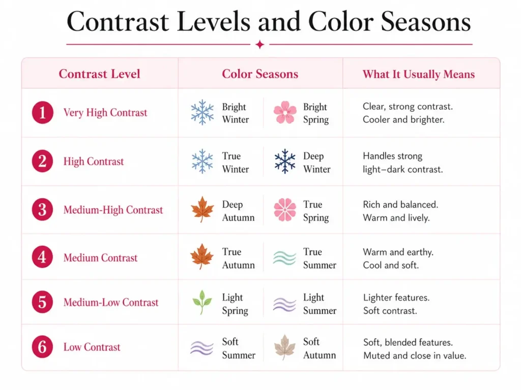
Very High Contrast Color Seasons
Bright Winter
Bright Spring
These seasons often have clear coloring and strong feature contrast. Bright Winter is usually cooler and sharper. Bright Spring is usually warmer and brighter.
High Contrast Color Seasons
True Winter
Deep Winter
Winter seasons often handle stronger contrast well, especially clear dark and light pairings. Deep Winter can also have depth, so dark colors often feel natural.
Medium-High Contrast Color Seasons
Deep Autumn
True Spring
Deep Autumn may have a rich, deep look without the sharpness of Winter. True Spring can have a clear, warm, bright look, often with more lift than softness.
Medium Contrast Color Seasons
True Autumn
True Summer
True Autumn often has warm, earthy coloring with medium depth. True Summer often has cool, soft coloring with a medium level of contrast.
Medium-Low Contrast Color Seasons
Light Spring
Light Summer
These seasons usually have light features. The contrast may be low in depth, but the colors can still be fresh and clear.
Low Contrast Color Seasons
Soft Summer
Soft Autumn
Soft Summer and Soft Autumn often have features that blend gently. Their best colors are usually muted, soft, and close in value.
Important
Going gray or silver can lower your contrast level. You may not change your whole season, but you may start liking lighter or softer colors within your palette.
High Contrast vs. Low Contrast Makeup
Makeup works the same way as clothing.
High contrast makeup:
More defined brows
Clearer lash line
Stronger lip color
More visible cheek color
Sharper light and dark placement
Low contrast makeup:
Softer brows
Blended eyeliner or mascara
Gentle lip color
Soft cheek color
Less sharp shading
Medium contrast makeup:
Defined but blended eyes
Natural brow shape with some depth
Medium lip tones
Balanced cheek color
If your makeup looks separate from your face, the contrast may be too high. If it vanishes and makes you look washed out, the contrast may be too low.
How Contrast Affects Prints and Patterns
Prints are where contrast becomes very useful.
If you have high contrast features, you can often handle prints with stronger light and dark areas. Black and white checks, navy and white stripes, or bold floral prints can work well if they match your season.
If you have low contrast features, softer prints often look better. Like tone-on-tone florals, soft stripes, watercolor-style prints, or small patterns with close values.
If you have medium contrast, choose prints that have some difference, but not the highest contrast. A medium blue and cream print may work better than black and white.
Look at Pattern Scale
A strong contrast pattern can feel even stronger if the print is large. A low contrast pattern can still feel interesting if the fabric has texture or a nice shape.
Does Contrast Make You Look Warm or Cool?
Contrast does not decide whether you are warm or cool.
Warmth comes from undertone. Contrast comes from the light and dark gap between your features.
That is why a person can be:
Warm and high contrast
Warm and low contrast
Cool and high contrast
Cool and low contrast
If someone says contrast makes you feel warm, they may mean that soft, close-value outfits can feel gentle, while strong contrast can feel sharper. But in color analysis, warm and cool are about undertone, not contrast.
Common Mistakes When Checking Contrast
1: Only looking at hair color
Dark hair does not always mean high contrast. If your skin and eyes are also deep, your contrast may be lower than you think.
2: Ignoring eyebrows
Brows can change the contrast of the face. Dark brows on light skin can raise contrast, even if the hair is lighter.
3: Using a filtered photo
Filters change value. Use a plain photo in natural light.
4: Wearing heavy makeup in the test
Makeup can raise your contrast. For the most accurate result, use a bare face or light everyday makeup.
5: Thinking contrast is fixed forever
Hair color changes, skin tone can shift, and going gray can soften contrast. Recheck your level if your hair changes a lot.
How To Dress for Your Contrast Level
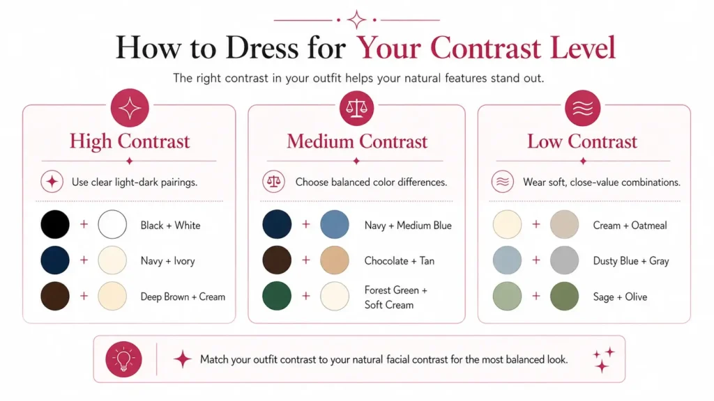
If you are high contrast:
Use clear light and dark pairings
Try stronger prints
Keep some definition near the face
Use a light top under a dark jacket, or the reverse
Avoid outfits that are too flat from head to toe
If you are low contrast:
Use close-value outfits
Try soft monochrome looks
Add texture instead of harsh contrast
Choose prints with gentle value changes
Avoid very sharp light and dark pairings near the face
If you are medium contrast:
Use balanced pairings
Try medium-depth prints
Avoid going too soft or too sharp
Repeat your natural contrast in your outfit
Use accessories to adjust contrast when needed
A good contrast match should make your face look clear first. If people notice the outfit before they notice you, the contrast may be off.
What Color Contrasts with Brown?
Brown can contrast with several colors, depending on the brown.
Light brown contrasts well with:
Navy
Deep teal
Forest green
Black, if the person can handle stronger contrast
Dark brown contrasts well with:
Cream
Ivory
Pale blue
Soft pink
Light sage
Warm brown often works well with blues because blue and orange sit across from each other on many color wheels, and brown is usually a darker, softer form of orange.
Quick Contrast Test
Use this fast check:
- Take a clear face photo.
- Turn it black and white.
- Compare your hair, brows, eyes, and skin.
- Place each feature on a 1 to 10 gray scale.
- Subtract the darkest number from the lightest number.
- Use the result as your contrast level.
- 0 to 3: Low contrast
- 4 to 6: Medium contrast
- 7 or more: High contrast
Then Test Outfits
- High contrast: Try a light top with a dark layer.
- Low contrast: Try a soft one-color outfit.
- Medium contrast: Try a mid-level mix such as navy and denim or brown and tan.
The outfit that makes your face look clearer is usually the better match.
Final Thoughts
Your contrast level is the light and dark gap in your natural features. Once you understand it, outfits, prints, makeup, and even hair color choices start to make more sense.
High contrast people usually need stronger light and dark pairings. Low contrast people usually need softer, closer colors. Medium contrast people do best with balance.
Do not treat this as a strict box but as practical check. When your outfit repeats your natural contrast, your face looks clearer, and your colors feel easier to wear.