

Have you ever worn a color that looked great on someone else, then wondered why it felt completely different on you?
Maybe a soft beige makes your friend look fresh but leaves you looking tired. A bright red may look balanced on one person but seem to arrive in the room before another person’s face does. Even two shades that are both called pink can behave very differently once they are next to your skin.
That is where color harmony becomes useful.
In general color theory, color harmony describes how colors relate visually. In personal color analysis, it looks at how the colors you wear interact with the colors already present in your skin, hair, eyes, brows, and lips.
The point is not to decide if you are attractive in a color. It’s about understanding why one red works better than another, why one beige feels natural while another looks dull, and which part of the color is causing the difference.
Table of Contents
What Is Color Harmony?
Color harmony starts with the relationship between colors.
In traditional color theory, colors can be grouped using familiar color-wheel relationships:
- Monochromatic schemes use variations of one hue.
- Analogous schemes use neighboring colors on the color wheel.
- Complementary schemes pair colors from opposite sides of the wheel.
- Triadic schemes use three colors spaced around the wheel.
These systems help explain why certain color combinations can feel organized or balanced when used together.
But personal color harmony adds another layer.
Now the question is not only:
“Do these colors work together?”
It is also:
“How do these colors work next to me?”
Color-to-Color Harmony vs. Color-to-Person Harmony
These two ideas are related, but they are not the same.
Color-to-color harmony looks at how two or more colors interact with each other.
For example:
- Navy with light blue
- Red with green
- Teal with blue and violet
- Black with grey
Color-to-person harmony looks at how a color interacts with your natural coloring.
You could build a perfectly valid blue-and-orange complementary outfit, but that does not mean every blue and every orange will have the same effect next to your complexion.
A clear cobalt and a smoky slate blue are both blue.
A bright tangerine and a muted rust are both orange.
But they differ in temperature, depth, and chroma. Those differences matter once the color is placed next to your face.
That is the foundation of personal color harmony.
Your Natural Coloring Is Already a Color Palette
Before you wear any clothing, you already have color relationships in your appearance.
Look at:
- Your skin
- Your natural lip color
- Your eyes
- Your brows
- Your natural hair
- The difference between your lightest and darkest features
These are not one flat color.
Your eyes may contain several tones. Your hair may have both depth and warmth. Your skin may look warmer, cooler, more neutral, or slightly olive depending on the person.
There is also contrast.
Someone may have very light skin and very dark hair. Another person may have skin, hair, and eyes that sit much closer together in depth.
Personal color analysis uses several traits to describe these differences, including undertone, chroma, hair depth, eye color, and overall contrast.
The important point is:
The color you wear is being added to colors that are already there.
That is why the same shirt does not create the same visual relationship on everyone.
The 4 Color Qualities That Affect Personal Color Harmony
You do not need to memorize hundreds of color names.
It is more useful to learn how to break a color down.
Start with four questions:
- Is it warm or cool?
- Is it light or deep?
- Is it clear or muted?
- How much contrast does it create?
These four checks explain a lot more than the name printed on a clothing tag.
1. Undertone – Warm vs Cool
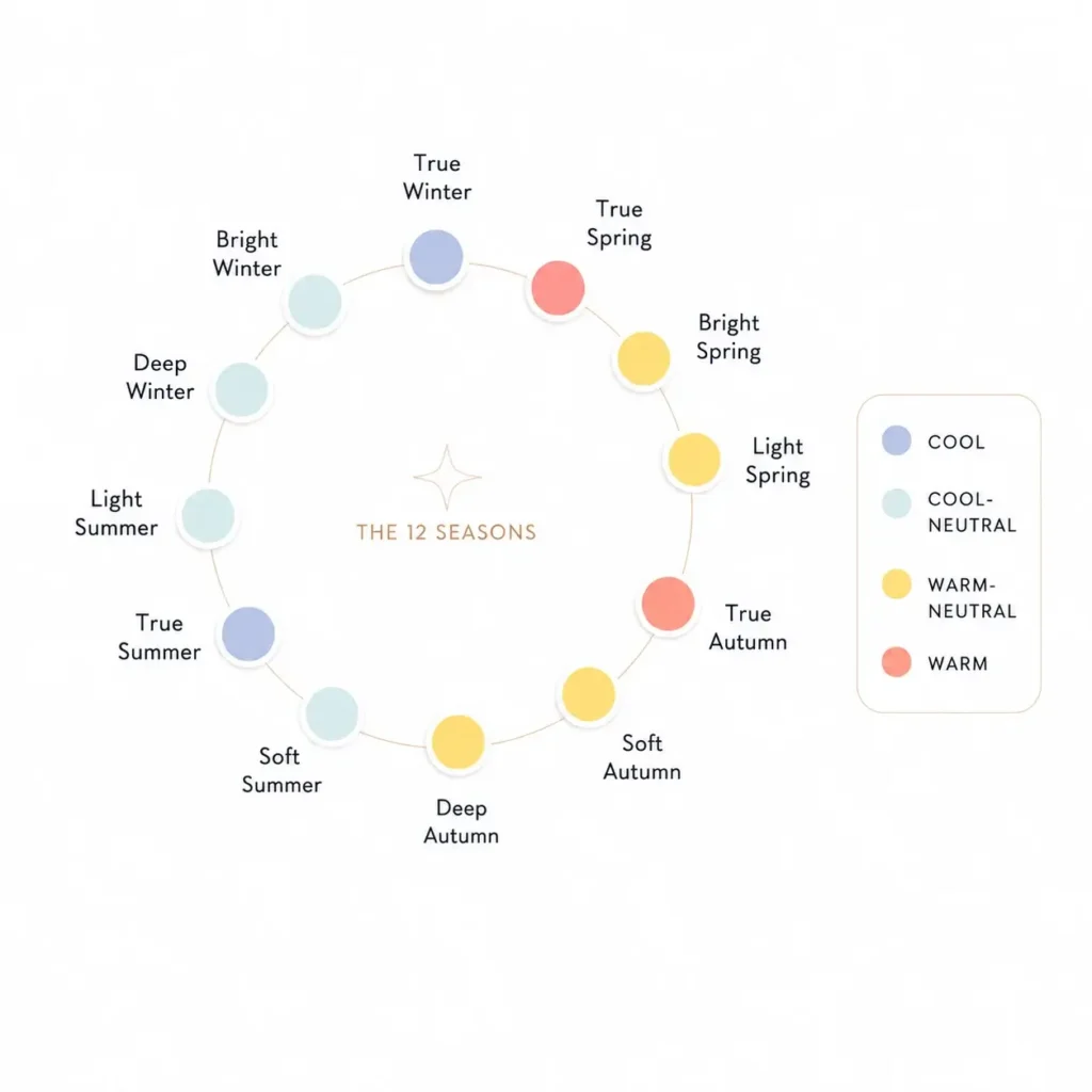
Color temperature tells you if a shade leans warmer or cooler.
It is easiest to understand when you compare two colors from the same family.
Take red.
A tomato red contains more orange or yellow influence.
A raspberry red leans more toward blue or magenta.
Both are red.
But visually, they are not interchangeable.
The same thing happens with pink:
- Peach pink is warmer.
- Blue-based rose is cooler.
With green:
- Olive and moss lean warmer.
- Blue-green and many emeralds lean cooler.
With neutrals:
- Camel and cream tend to lean warmer.
- Blue-grey and many charcoals lean cooler.
This is why statements like “I look good in red” are not specific enough.
The better question is:
Which red?
Warm and cool also exist on a range.
You do not have to be extremely warm or extremely cool. Personal color systems often include warm-neutral and cool-neutral positions because many people sit somewhere between the two ends.
Temperature Alone Is Not Enough
It is important. Suppose you have cool coloring.
You find a cool blue.
That does not automatically make it a great choice.
The blue could still be:
- Far too dark
- Much too bright
- Too greyed
- Too light
- Too strong beside your natural contrast
A correct undertone can still come with the wrong value or chroma.
That is why undertone tests are only the beginning.
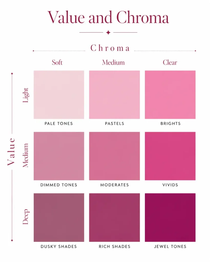
2. Value – Light vs Deep
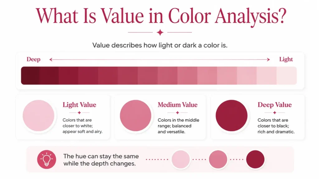
Value is simply how light or dark a color is.
In the Munsell color system, value is one of the three main color attributes, along with hue and chroma. It runs from black at the darkest end to white at the lightest end.
You do not need to assign numbers to your clothes.
You only need to compare.
Take blue again:
- Powder blue
- Medium denim blue
- Deep navy
Same broad color family.
Very different value.
Now think about what happens when each one sits beside a person.
If someone’s overall coloring is very light, a near-black navy may become the strongest thing in the entire look.
If someone has deeper coloring, the same navy may feel much more natural.
A very pale powder blue can create the opposite effect. It may work easily with light coloring but feel weak against deeper features unless stronger colors are added elsewhere.
Why Value Matters More Than People Realize
People often focus on warm vs cool and ignore depth.
That can lead to confusing results.
You may correctly figure out that cool colors work well for you but still dislike half of the cool colors you try.
The problem may not be temperature.
It may be value.
Compare:
- Icy pink
- Medium rose
- Deep berry
All three can lean cool.
But one is very light, one sits in the middle, and one is deep.
The difference can be large enough to completely change how the color feels on you.
3. Chroma – Clear vs Muted
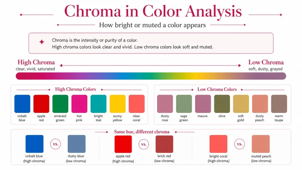
Chroma tells you how strong or subdued a color appears.
The Munsell system uses chroma as one of its three main color attributes, while the CIE defines chroma in relation to perceived colorfulness.
In everyday clothing language, it is easiest to think of chroma as a range from clear and vivid to soft and greyed.
Compare:
- Electric cobalt vs smoky blue
- Hot pink vs dusty rose
- Clear emerald vs sage
- Bright coral vs muted terracotta
- Vivid violet vs grey-lavender
You can usually see the difference immediately.
The clearer shade looks stronger.
The muted shade looks softer.
Chroma Is Not the Same as Lightness
This is where people get confused.
A light color is not automatically muted.
A dark color is not automatically strong.
You can have:
- Light and clear
- Light and muted
- Deep and clear
- Deep and muted
For example, a clean candy pink can be light and clear.
A dusty blush can be light and muted.
A strong sapphire can be deep and clear.
A smoky navy can be deep and muted.
So when someone says:
“Bright colors look bad on me,”
you need to know if they mean:
- Too light
- Too saturated
- Too neon
- Too high in contrast
Those are different problems.
How Chroma Affects Personal Harmony
Some people have coloring that reads clearer and more defined.
Others have softer color relationships, with less obvious separation between skin, eyes, brows, and hair.
A highly saturated shirt may feel balanced next to clearer coloring but much louder beside softer coloring.
A muted taupe or dusty blue can produce the reverse effect. It may look calm and connected on softer coloring but flat beside someone whose features appear much clearer. Personal color analysis commonly assesses chroma separately from undertone and contrast for this reason.
Again, one is not better.
They create different relationships.
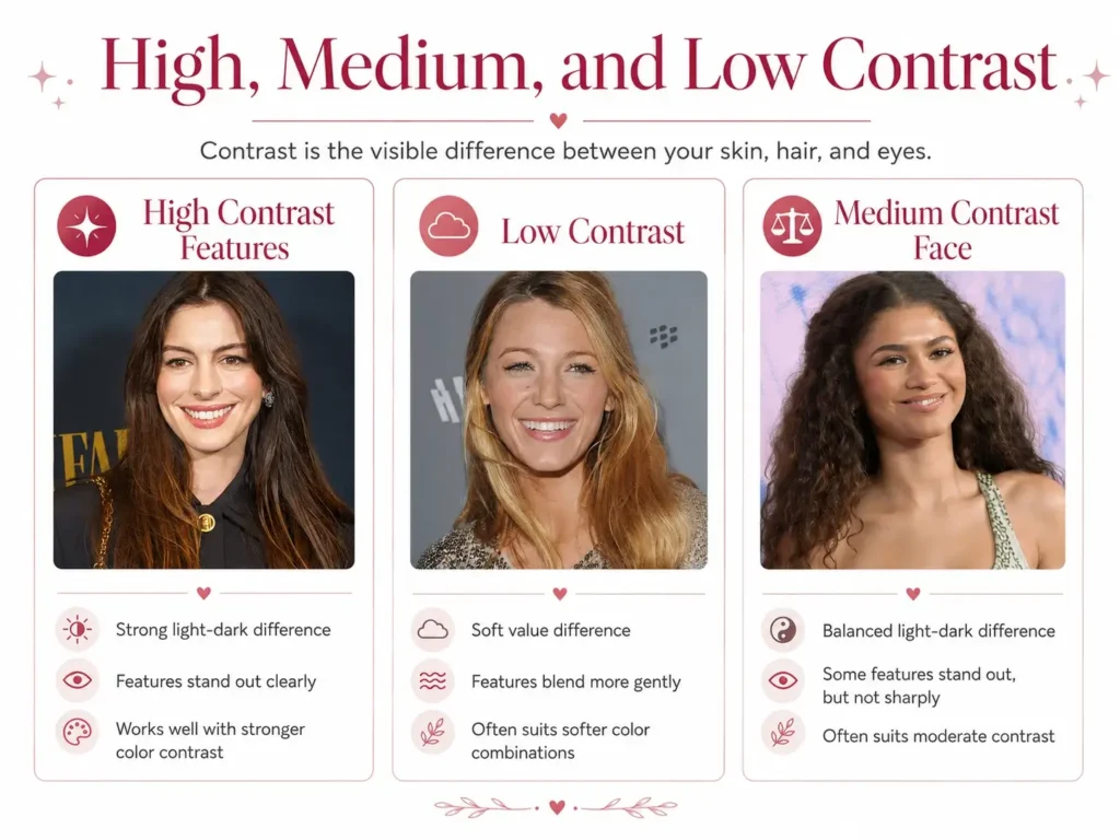
4. Contrast – How Much Difference Does Your Coloring Have?
Contrast is about difference.
Think about the lightest and darkest colors already present in your face and hair.
If you have very light skin and very dark hair, the difference may be strong.
If your skin, hair, brows, and eyes sit fairly close together in depth, the difference may be smaller.
Personal color analysis often describes overall contrast as low, medium, high, or very high.
Contrast becomes especially useful when you combine colors in an outfit.
Compare:
High contrast:
- Black and white
- Navy and cream
- Deep burgundy and pale pink
- Charcoal and icy blue
Lower contrast:
- Taupe and dusty rose
- Sage and mushroom
- Denim blue and soft grey
- Camel and muted rust
The first group has larger light-dark differences.
The second group stays closer together.
Contrast Is a Relationship, Not a Single Color
You cannot really call one shirt “high contrast” by itself.
Contrast needs something to be contrasted against.
A white shirt against black trousers creates strong value contrast.
The same white shirt with pale beige trousers creates much less.
Your own coloring also becomes part of that relationship.
This is why contrast is slightly different from undertone, value, and chroma.
It describes what happens between colors.
Why the Same Color Looks Different on Different People
You are not imagining this.
Color perception is affected by context.
The perceived color depends not only on the stimulus itself but also on surrounding conditions, the observer’s visual adaptation, and the context in which the color is seen.
Personal color analysis takes that basic idea into clothing and appearance.
It does not mean every personal-color rule has been scientifically proven. Personal color analysis is still a styling framework based partly on visual comparison and judgment.
But the underlying point is sound:
A color is never experienced completely on its own.
Once you wear it, you see it beside your:
- Skin
- Hair
- Eyes
- Makeup
- Jewelry
- Other clothing
- Surrounding light
That changes the total effect.
The Undertone Relationship Changes
Take a cool raspberry top.
On one person, its blue-red direction may sit comfortably beside the skin.
On another, that same cool quality may stand out strongly against warmer coloring.
The raspberry did not become cooler.
Its context changed.
The Depth Relationship Changes
Take a very deep burgundy.
Next to dark hair and deeper features, it may feel balanced.
Next to very light hair, skin, and brows, it may become the strongest visual element in the look.
Again, the burgundy did not change.
The relationship did.
The Chroma Relationship Changes
Try a very clear hot pink.
On someone with strong, clear coloring, it may feel lively without taking over.
On someone whose coloring is much softer, the pink may look much more intense.
Switch that hot pink for dusty rose and the balance may change completely.
Contrast Changes
A crisp white top can create a strong light-dark difference beside dark hair.
Beside very light hair, the same white may create far less contrast.
This is why copying someone else’s “best colors” rarely works perfectly.
You are copying the color, not the context.
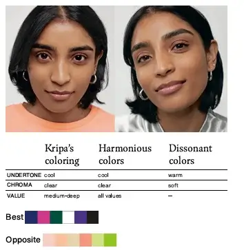
What Does a Harmonious Color Actually Look Like on You?
Do not expect a dramatic movie-style transformation every time you test a color.
Sometimes the difference is obvious.
Sometimes it is subtle.
And sometimes two shades both work.
The best way to judge personal color harmony is through comparison.
Put two similar colors near your face and switch between them.
Then look at your face before looking at the fabric.
You are checking whether one color feels more connected to your coloring than the other.
In practice, look for things like:
- Your face stays visually present.
- The clothing does not seem to arrive before you do.
- Your skin looks reasonably even.
- Your natural lip color remains visible.
- Your eyes do not seem dulled by the surrounding color.
- Shadows around the eyes, mouth, or jaw do not suddenly become the main focus.
- The color feels related to your features rather than separate from them.
Do not turn this into a hunt for flaws.
The goal is comparison. You are asking:
“What changes when I switch colors?”
That is much more useful than staring at one shirt and asking whether you look good.
Harmony Does Not Mean “You Look Prettier”
Color harmony is not a beauty score.
A harmonious color is not proof that you are attractive.
A less harmonious color does not make you unattractive.
It simply creates a different visual relationship.
A color that sits outside your easiest range may still look:
- Bold
- Graphic
- Dramatic
- Playful
- Strong
- Interesting
You may even prefer that effect.
Someone with low natural contrast may love hard black-and-white outfits precisely because they create more contrast.
Someone with warm coloring may love icy silver because it creates tension.
Someone with soft coloring may enjoy neon pink because it looks intentionally loud.
That is personal style.
Color harmony gives you information. You decide what to do with it.
Harmony Exists on a Spectrum
Thinking in terms of “good colors” and “bad colors” is too rigid. A spectrum is more useful.
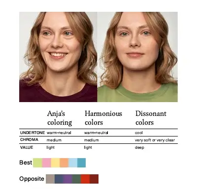
Perfect Match
A color closely lines up with the main qualities of your coloring.
Its temperature works well.
Its depth feels balanced.
Its chroma sits comfortably beside your features.
The overall contrast makes sense.
These are usually the shades that feel easiest to wear.
You may be able to wear them with very little makeup or styling effort because the color itself already feels connected.
Harmonious
The shade works well overall, even if one property is not exact.
Maybe it is slightly deeper than ideal.
Maybe it leans a little more neutral than your strongest colors.
Maybe its chroma is a touch stronger.
It still sits comfortably within your range.
This group is often more useful than chasing only perfect matches because it gives you more options.
Okay
The color is neither a great match nor a strong clash.
It works.
It may not do anything especially helpful, but it does not cause obvious tension either.
A lot of everyday clothing probably falls here.
That is normal.
Not every basic T-shirt needs to be your single best color.
Dissonant
Now one or more properties start pulling strongly away from your coloring.
The shade may be:
- Much too warm
- Much too cool
- Too deep
- Too pale
- Far too clear
- Much too muted
You may notice the clothing before the person, or the shade may seem visually separate.
Current personal-color analysis frameworks use terms such as “dissonant” and “clash” specifically to describe these stronger mismatches.
Clash
A clash usually means several important properties are far apart at the same time.
For example, imagine someone whose coloring is:
- Light
- Warm
- Soft
Now place an extremely:
- Deep
- Cool
- Highly saturated
violet directly beneath the face.
The shade differs in several ways at once.
That creates much more tension than a color that is only slightly too cool.
You can still wear it.
You just know what effect it is creating.
Warm and Cool Color Harmony Explained
Warm vs cool gets a lot of attention because temperature can be fairly easy to spot once you start comparing similar colors.
The trick is to compare within one color family.
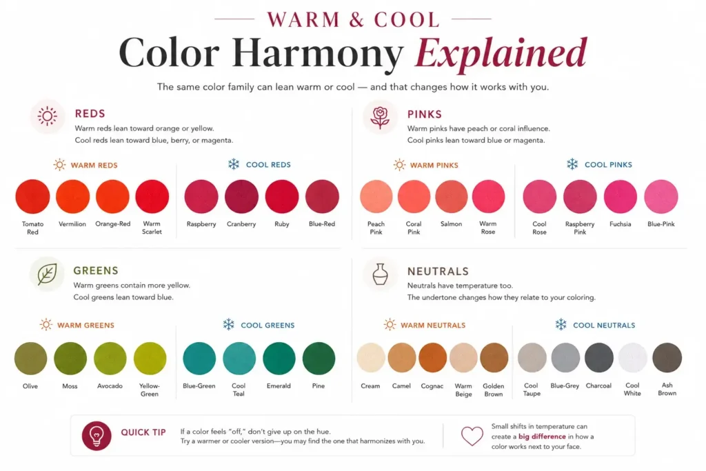
Warm Red vs Cool Red
Warmer reds lean toward orange or yellow.
Think:
- Tomato red
- Vermilion
- Orange-red
- Warm scarlet
Cooler reds lean toward blue, berry, or magenta.
Think:
- Raspberry
- Cranberry
- Ruby
- Blue-red
If one red looks wrong, do not decide that red is not your color.
Try moving the temperature.
Warm Pink vs Cool Pink
Warmer pinks include:
- Peach pink
- Coral pink
- Salmon
- Warm rose
Cooler pinks include:
- Cool rose
- Raspberry pink
- Fuchsia
- Blue-pink
This is why “pink is cool” is not a useful rule.
Pink can move quite far in either direction.
Warm Green vs Cool Green
Warmer greens contain more obvious yellow influence:
- Olive
- Moss
- Avocado
- Yellow-green
Cooler greens lean toward blue:
- Blue-green
- Cool teal
- Emerald
- Pine
Someone who dislikes olive may look much better in blue-green.
Someone who finds emerald too sharp may feel far more comfortable in moss.
The problem was not “green.”
It was the version of green.
Warm Neutral vs Cool Neutral
Neutrals have temperature too.
Warm neutrals include:
- Cream
- Camel
- Cognac
- Warm beige
- Golden brown
Cooler neutrals include:
- Cool taupe
- Blue-grey
- Charcoal
- Cool white
- Ash brown
This is particularly useful when shopping for basics.
If beige always seems wrong, try asking what kind of beige you keep choosing.
A yellow-beige, pink-beige, grey-beige, mushroom, stone, and taupe can all behave differently.
Why “This Color Suits Me” Is Often Too Broad
The more you learn about color, the less useful broad statements become.
“I cannot wear green.”
“Red suits me.”
“Blue washes me out.”
These statements may be based on real experience, but they do not explain enough.
Try making them more specific.
Instead of:
“I cannot wear green.”
Try:
“Muted yellow-greens make me look flat, but clearer blue-greens work.”
Instead of:
“Red suits me.”
Try:
“Medium-deep cool reds work better than orange-red or bright scarlet.”
Instead of:
“Beige looks awful on me.”
Try:
“Light yellow-beige is difficult, but cooler taupe and pink-beige work better.”
Now you have information you can actually use while shopping.
The goal is to describe the shade through:
- Hue
- Temperature
- Value
- Chroma
For example:
“Medium cool blue with slightly muted chroma”
tells you far more than:
“Blue.”
Color theory becomes useful when it helps you see these differences. The Munsell system itself separates color into hue, value, and chroma because one color name cannot fully describe how a shade appears.
How to Know If a Color Suits You
You can do a useful comparison at home.
You do not need to start with a season.
Start with the color properties.
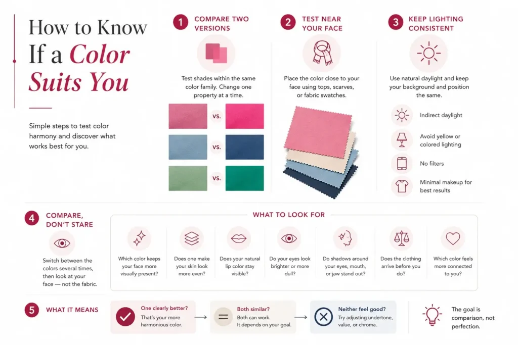
Compare Two Versions of the Same Color
Do not test random shades if you are trying to learn something specific.
If you want to test temperature:
Compare:
- Peach pink vs cool rose
- Tomato red vs raspberry
- Olive vs blue-green
- Cream vs cool white
If you want to test value:
Compare:
- Powder blue vs navy
- Pale pink vs berry
- Light beige vs dark brown
If you want to test chroma:
Compare:
- Dusty pink vs hot pink
- Smoky blue vs cobalt
- Sage vs clear green
Change one main property at a time when you can.
That helps you identify the reason behind the difference.
Test Colors Close to Your Face
If you want to judge complexion harmony, place the color close to your face.
Use:
- Tops
- Scarves
- Jackets
- Fabric swatches
- Towels
- Clothing held below the chin
Colors worn close to the face have a more direct visual relationship with your skin, eyes, hair, and lips than colors worn on trousers or shoes.
Keep the Lighting Consistent
Lighting can change how colors appear.
The CIE notes that perceived color depends partly on viewing conditions and the surrounding environment.
For a simple home test:
- Use indirect daylight.
- Stand in the same position.
- Avoid strong yellow bulbs.
- Avoid colored lighting.
- Turn off beauty filters.
- Keep your background reasonably neutral.
- Use little or no makeup if you want to judge your natural coloring.
You are trying to keep everything stable except the color you are testing.
Compare, Do Not Stare
Switch between the two colors several times.
Then ask:
- Which color makes my skin look more even?
- Does one make shadows more noticeable?
- Does one make my face seem separate from the clothing?
- Does one look much heavier?
- Does one seem too grey?
- Does one seem far brighter than my features?
- Do I notice the fabric before I notice my face?
- Is the main difference temperature, value, or chroma?
Sometimes there will be a clear winner.
Sometimes both will work.
Sometimes neither will.
That is still useful information.
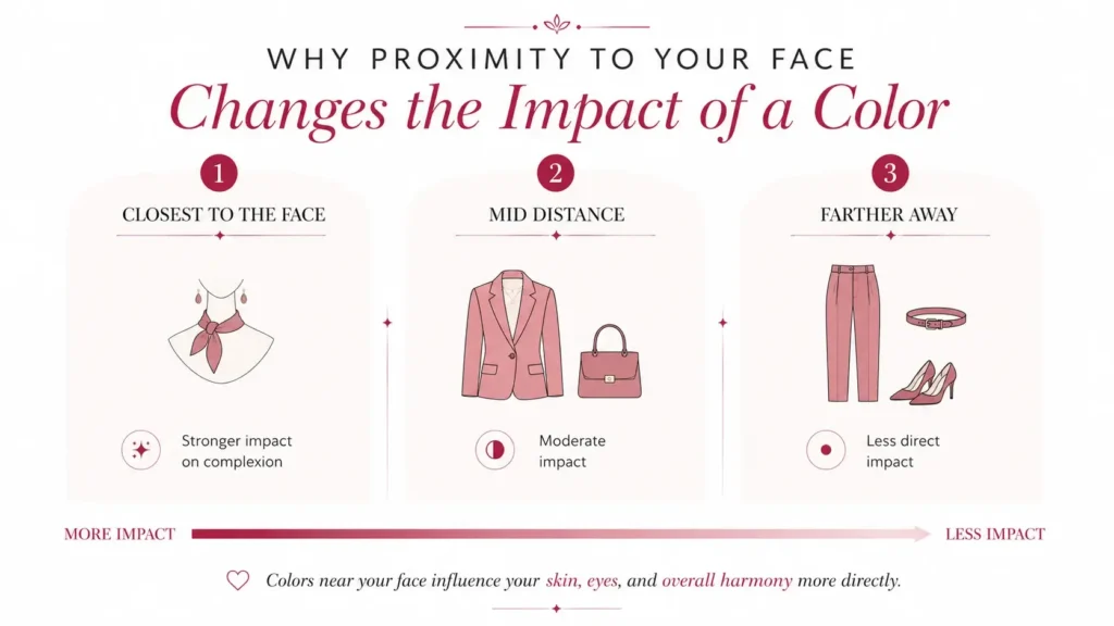
Why Proximity to Your Face Changes the Impact of a Color
Not every item in your wardrobe needs the same level of color harmony.
Placement matters.
Think about a warm orange.
Wearing orange as:
- Hair color
- Blush
- A scarf
- A turtleneck
- A necklace
- Large earrings
places it directly around your face.
Wearing orange as:
- Trousers
- A skirt
- Shoes
- A handbag
- A belt
keeps it farther away.
The color still affects the overall outfit, but it has less direct interaction with your complexion.
That means a shade you dislike as a sweater may be completely fine as trousers or shoes. Colors outside your easiest palette can be used this way without removing them from your wardrobe.
This is a much more useful question than:
“Can I wear orange?”
Ask:
“Where do I want to wear orange?”
Why the Amount of Color Matters
Placement is not the only thing that changes impact.
Amount matters too.
Compare wearing bright fuchsia as:
- A full coat
- A dress
- A sweater
- A patterned scarf
- A handbag
- Earrings
- Nail polish
The color stays fuchsia.
But its share of your overall look becomes smaller and smaller.
A color that feels overpowering across your entire upper body may feel completely comfortable as a small accent. Using smaller amounts of less harmonious colors is a practical way to keep colors you enjoy without letting them control the whole look.
Think in terms of visual area.
The more space a color takes up, the more influence it has.
Can You Wear Colors That Do Not Harmonize with You?
Yes.
You do not need permission from a color palette.
Personal color analysis works best when it helps you make choices, not when it removes choices.
If you love a color that is not one of your easiest shades, you have several ways to use it.
Move the Color Away From Your Face
Wear it in:
- Trousers
- Skirts
- Shoes
- Bags
- Belts
This is the easiest fix.
Wear Less of It
Use it in:
- Prints
- Nail polish
- Small accessories
- Jewelry
- Stripes
- Small pattern details
You still get the color without giving it a large visual role.
Put a More Harmonious Color Near Your Face
Suppose you own a jacket that feels slightly wrong against your complexion.
Wear a better-colored top under it.
Or add a scarf.
Now the color closest to your face changes, while you still get to wear the jacket.
Change the Version of the Color
This is often the best answer.
Do not give up an entire hue because one version looks wrong.
If bright orange feels difficult, try:
- Peach
- Coral
- Rust
- Terracotta
- Red-orange
If one blue looks wrong, try moving between:
- Powder blue
- Denim
- Cobalt
- Teal
- Navy
- Smoky blue
If beige feels difficult, compare:
- Warm beige
- Pink-beige
- Taupe
- Mushroom
- Camel
- Stone
You are changing the property that causes the problem rather than abandoning the whole color family.
Color Harmony vs Personal Preference
These are two separate questions.
Color harmony asks:
“How does this shade interact with my natural coloring?”
Personal preference asks:
“Do I actually want to wear it?”
A color can work extremely well with your complexion and still feel wrong for your style.
Maybe you dislike pastels.
Maybe you never wear brown.
Maybe a soft palette feels too quiet for you.
That matters.
The reverse is also true.
You can love a color that creates obvious contrast with your natural coloring.
That matters too.
A useful color palette should support your style, not replace it.
Does Your Color Season Determine Every Color You Can Wear?
No.
A seasonal label is a shorthand for several color properties that tend to appear together.
Those properties can include:
- Undertone
- Value
- Chroma
- Contrast
The season name itself is not what makes a color work.
The underlying properties are.
Instead of saying:
“This blue works because you are a Summer,”
a more useful explanation is:
“This blue works because it is cool enough, moderately deep, and soft enough to relate well to your coloring.”
That tells you what to look for the next time you shop.
Seasonal palettes can help organize colors, but they should not stop you from judging individual shades. Even people within the same seasonal group can differ in undertone strength, depth, chroma, and contrast.
Understanding the properties gives you more control than memorizing a season name.
Quick Color Harmony Checklist
When a color feels wrong, use this before rejecting it.
| Question | What You Are Checking |
|---|---|
| Does it lean too warm or too cool? | Undertone |
| Is it too light or too dark? | Value |
| Does it look too vivid or too greyed? | Chroma |
| Is the light-dark difference too strong or too weak? | Contrast |
| Is the color directly beside my face? | Proximity |
| How much of the color am I wearing? | Amount |
The main rule is simple:
Do not reject the entire color family until you know which property is causing the problem.
You may not dislike green.
You may dislike muted yellow-green.
You may not dislike red.
You may dislike orange-red.
You may not dislike beige.
You may dislike very light warm beige.
That level of detail makes color decisions much easier.
Frequently Asked Questions
What is color harmony in simple terms?
Color harmony is the visual relationship between colors.
In traditional color theory, it usually describes how colors work together in combinations such as monochromatic, analogous, complementary, or triadic palettes.
In personal color analysis, the same idea is applied to the relationship between clothing colors and your natural coloring.
What makes a color flattering?
Within personal color analysis, a color usually feels more harmonious when its temperature, value, chroma, and resulting contrast sit comfortably beside your natural coloring.
That does not make “flattering” an objective beauty rule.
It is a visual judgment about relationships between colors.
Why do some colors wash me out?
There is no single cause.
The shade may be:
Too muted
Too light
Too close to your skin in value
Too warm
Too cool
Too weak beside your natural contrast
Do not assume you always need a darker color.
Sometimes you need more chroma.
For example, replacing dusty blue with a clearer medium blue may help more than switching to navy.
Why does the same color look different on different people?
Because color is seen in context.
The surrounding skin, hair, eyes, makeup, clothing, and lighting change the overall visual relationship. Color science also recognizes that perceived color is affected by its surround and viewing conditions.
Do colors have to match my undertone?
No.
Undertone is only one part of the relationship.
A slightly cooler or warmer color may still work well if its value and chroma are good matches.
Neutral-leaning coloring can also make the temperature range wider.
Can a color have the right undertone and still look wrong?
Yes.
A cool blue can still be too dark.
A warm coral can still be too bright.
A neutral taupe can still be too muted.
Getting one property right does not guarantee that the others will work.
Can I wear colors outside my color palette?
Yes.
Try wearing them farther from your face, using smaller amounts, placing a more harmonious color closer to your face, or choosing another version of the same hue.
A palette is most useful as a reference, not a restriction.
Does color harmony matter for trousers and shoes?
It matters for the outfit, but it matters less for your complexion.
Colors near your face have a more direct visual relationship with your skin, hair, eyes, and lips.
That makes tops, scarves, jackets, jewelry, makeup, and hair color more important when you are thinking specifically about personal color harmony.
Is color harmony the same as seasonal color analysis?
No.
Color harmony is the broader idea.
Seasonal color analysis is one system used to group combinations of undertone, depth, chroma, and contrast.
You can learn how color harmony works without knowing your season.
In fact, understanding the individual color properties often helps more than memorizing a seasonal palette.
Final Takeaway
Color harmony is not about memorizing a list of approved colors.
It is about understanding what happens when one color is placed beside another.
You already have color in your skin, hair, eyes, brows, and lips. The clothing you add has its own temperature, value, and chroma. Together, those colors also create contrast.
That is why two reds can behave completely differently on you, and why the same blue can look balanced on one person and much stronger on another.
When a color feels wrong, do not stop at:
“This color does not suit me.”
Ask a better question.
Is it too warm?
Too cool?
Too deep?
Too light?
Too clear?
Too muted?
Once you know the answer, you can usually find a version of the color that works better, or decide to use the original shade in a different way.
That is the useful part of color harmony. It helps you understand the color instead of simply following a list.