

You research about undertone, find out you’re warm, you go home and put away every blue thing you own. Then you see someone with similar coloring wearing blue and looking great in it.
The problem is incomplete advice. Color analysis doesn’t forbid you to wear specific colors. You need to find which version of each color works for you. Almost every color family has warmer and cooler members, and once you know how to spot the difference, color analysis becomes much easier to use in real life.
This page covers the eight color families, what actually makes a shade warm or cool, why some families do not split evenly, and where neutrals fit into the system.
Table of Contents
What is a Color Family?
Every color has a hue. Hue is the color’s position on the visible spectrum, the thing that makes something read as red instead of green. A color family, sometimes called a hue family, is a broad section of that spectrum grouped under one name.
Here is the distinction that clears up a lot of confusion in color analysis:
Hue tells you which family a color belongs to. Undertone tells you where it sits inside that family.
So, when someone says red is warm and blue is cool, they are describing whole color families in general terms. That works as a rough guide, but it becomes much less useful when you are standing in a shop holding two reds that look completely different.
Cherry red and tomato red are both red. One leans blue-pink, while the other leans orange. They will not have the same effect next to your face.
The Eight Color Families
The hue spectrum can be divided into eight families:
- Red. Cherry, crimson, tomato, brick.
- Orange. Rust, apricot, tangerine, terracotta.
- Yellow. Lemon, canary, mustard, gold.
- Green. Mint, emerald, moss, chartreuse.
- Cyan. Turquoise, aqua, teal, peacock.
- Blue. Sky, denim, cobalt, navy.
- Violet. Lavender, amethyst, plum, orchid.
- Pink. Coral, rose, fuchsia, magenta.
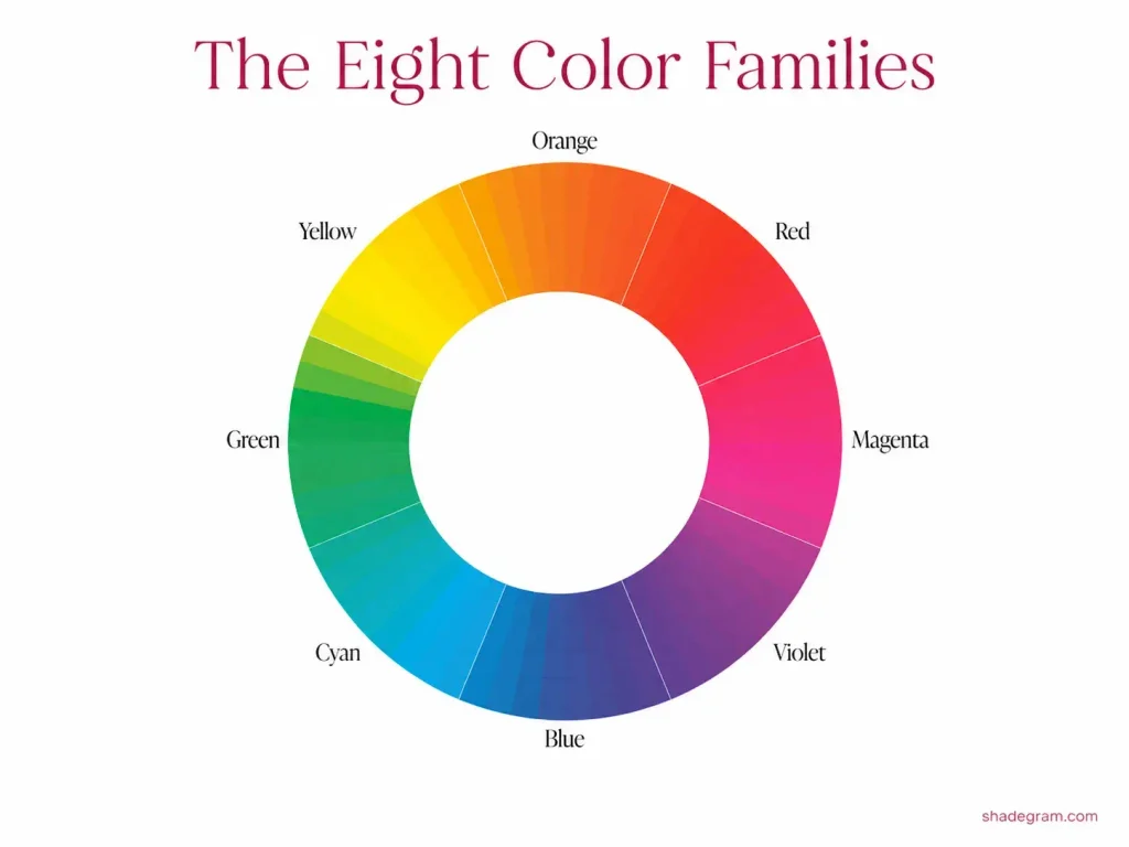
Why Eight and Not Seven?
A rainbow shows seven spectral colors, so eight can seem like one too many. The reason is that the hue spectrum is circular rather than a straight line.
If you could place the two ends of the spectrum together, the red band and violet band would meet and blend. At that meeting point you get magenta, which we usually group under pink.
Magenta does not appear as its own band in a single rainbow because it comes from the connection between the two ends of the visible spectrum.
That is why pink works better as its own family rather than simply being treated as a lighter red. It has its own place on the color wheel and its own temperature behavior.
Where Cyan Fits
A lot of color writing groups use turquoise and teal under either blue or green. For color analysis, it is more useful to treat cyan as its own family between the two.
That matters because blue and green behave very differently on the temperature scale, and teal does not behave exactly like either one.
If teal is grouped with blue, for example, you can easily end up with the wrong conclusion about its undertone.
What Actually Makes a Color Warm or Cool
Here is the model that makes the temperature scale easier to understand.
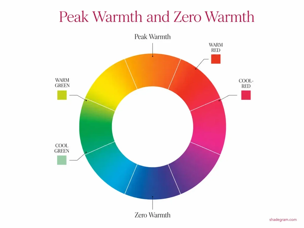
Peak Warmth and Zero Warmth
Somewhere around the middle of the orange family sits a tangerine shade. It is the point of peak warmth, the warmest area on the color wheel.
Directly opposite it sits an ultramarine blue that leans slightly violet and contains no yellow. This is the point of zero warmth, the coolest end of the scale.
Every other color sits somewhere between those two points. The closer a shade sits to tangerine, the warmer it is. The closer it sits to ultramarine, the cooler it becomes.
The part that often causes confusion is direction.
Moving away from tangerine in either direction makes a color cooler. A lemon yellow and a red-orange are both cooler than tangerine, even though we normally think of yellow and red-orange as warm colors.
That distinction clears up a lot of the usual confusion. Warmth is not simply about how much yellow a color contains. It is about how close that color sits to the warmest point of the wheel.
Temperature is Relative Inside a Family
If you hear that a green is warm, that means it is warm for a green. It sits closer to peak warmth than other greens do. It does not mean that green is warmer than an orange.
The same applies to pink. A warm pink leans toward red rather than violet. It is warm compared with other pinks.
So, a warm blue is still cooler than a cool orange.
For practical color analysis, temperature comparisons are most useful inside one color family. Comparing completely different families takes you back to broad warm-versus-cool labels, which are much less helpful when you are choosing actual clothes.
The Four Undertone Levels
Warm and cool gives you only two options, while most people do not sit at either extreme.
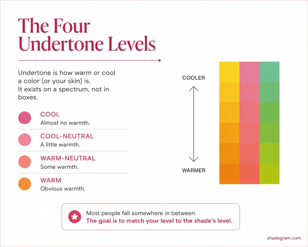
A four-point scale describes undertone more accurately:
- Cool. Almost no warmth.
- Cool-neutral. A little warmth.
- Warm-neutral. Some warmth.
- Warm. Obvious warmth.
Undertone itself is still a spectrum. These four labels are simply useful points along it.
There are two useful things to understand here.
- First, cool-neutral is very common across skin tones, which means a lot of people fall somewhere between the obvious warm and cool extremes.
- Second, colors can be sorted in the same way. A shade can be cool, cool-neutral, warm-neutral, or warm, and the goal is to find shades that sit near your own level.
If your coloring is warm-neutral, for example, your best colors are usually the warm-neutral versions of each family. Not necessarily the warmest shades available, and not the coolest. The match matters more than the label.
Family By Family: How Temperature Works in Each Color
The basic question stays the same for every family: which direction makes the color cooler, which makes it warmer, and what should you look for?
1. Red
Leans pink, cooler. Leans orange, warmer.
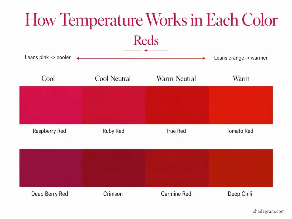
Red sits between orange and pink on the wheel, so those are the two directions it can move.
Cool reds include cherry, crimson, and raspberry red. Warm reds include tomato, scarlet, and brick.
One detail that rarely gets mentioned is that a true red is not completely neutral. It carries a slight amount of warmth.
For a red to read cool-neutral or cool, it usually needs a visible pink influence.
So, if you have always treated true red as the safe red for everyone, it is slightly warmer than that reputation suggests.
2. Orange
Leans red or yellow, cooler. Balanced red and yellow, warmer.
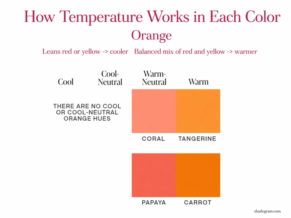
Orange contains the point of peak warmth, which means orange cannot become truly cool.
It can, however, become less warm.
An orange that pulls toward red or toward yellow sits farther from peak warmth than a balanced tangerine. Even the coolest oranges, though, still land around warm-neutral.
Cooler oranges include rust, apricot, and burnt orange. Warmer oranges include tangerine, marigold, and pumpkin.
It is also why the coolest color palettes often contain very little orange. There is no genuinely cool version of the family.
3. Yellow
Leans green, cooler. Leans orange, warmer.
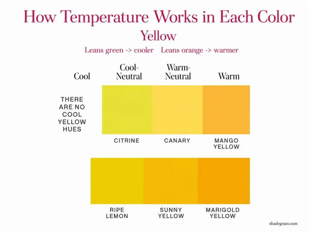
Yellow sits close to peak warmth, so it tends to be warm by default.
A fairly pure yellow such as canary, with very little red or green influence, sits around warm-neutral. That is close to the coolest point yellow can reach.
Cooler yellows include lemon and citron. Warmer yellows include mustard, golden yellow, and marigold.
Yellow also has an unusual value limit.
As bright yellow becomes deeper, it stops reading clearly as yellow and begins to look olive or brown. That means yellow does not really produce deep, rich shades in the same way blue or violet can.
4. Green
Leans cyan, cooler. Leans yellow, warmer.
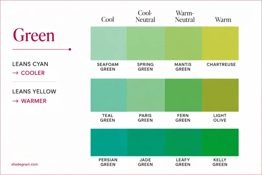
Green sits around the halfway point between peak warmth and zero warmth, which makes it one of the most flexible families.
A green can be strongly cool, strongly warm, or sit almost anywhere between the two.
Cool greens include mint, emerald, and pine. Warm greens include chartreuse, moss, and olive.
For a quick read, look at what seems to be mixed into the green.
More cyan or blue influence makes it cooler. More yellow makes it warmer.
5. Cyan
Leans blue, cooler. Leans green, warmer.
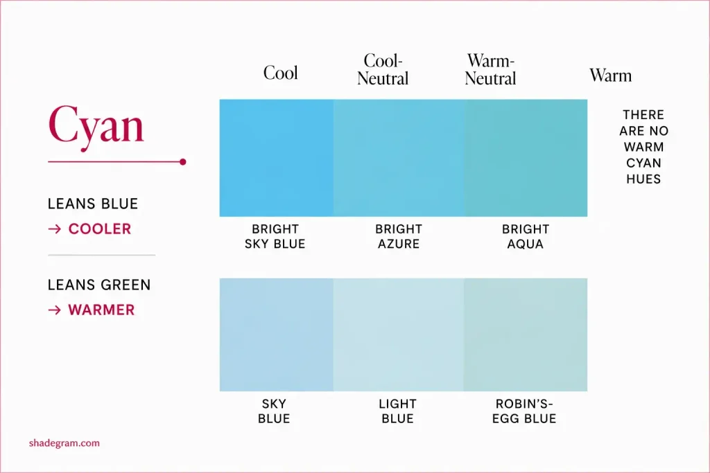
Cyan sits between blue and green, which limits how far its temperature can move.
It can range from cool to warm-neutral, but it does not reach fully warm.
Cooler cyans sit nearer blue. Warmer cyans move toward green, with the warmest examples getting quite close to the green family without fully crossing into it.
Cooler examples include peacock and deep teal. Warmer examples include turquoise, seafoam, and aqua.
6. Blue
Leans cyan, warmer. Less cyan, cooler.
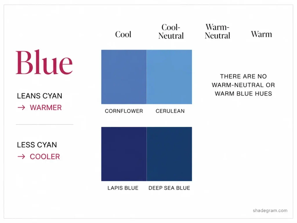
The zero-warmth point sits inside the blue family. That creates an important limit: blue does not reach warm or warm-neutral.
Its range runs from cool to cool-neutral.
Blues that lean violet, or seem to contain almost no yellow influence, read cool. Blues with a slight cyan influence move toward cool-neutral.
If enough yellow influence is added, the color stops being blue and moves into cyan.
Cool blues include ultramarine, indigo, and French navy. Cool-neutral blues include denim, marine, and periwinkle.
So, if your coloring is warm, you are not choosing between a warm blue and a cool blue. You are selecting the warmest available blue, which is usually a cool-neutral blue with a slight cyan influence.
7. Violet
Leans blue, cooler. Leans magenta, warmer.
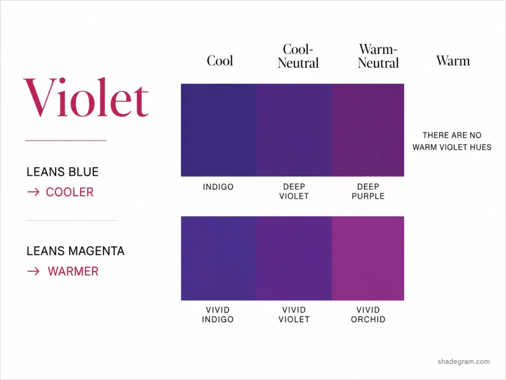
Violet sits fairly close to the zero-warmth side of the wheel, so the family tends to skew cool.
The more blue-based a violet is, the cooler it reads.
A warmer violet contains more red or magenta influence. Plum and orchid are good examples. Even then, violet usually tops out around warm-neutral rather than becoming fully warm.
Cool violets include lavender, amethyst, and blue-violet. Warmer violets include plum, orchid, and mauve.
8. Pink
Leans violet, cooler. Leans red, warmer.
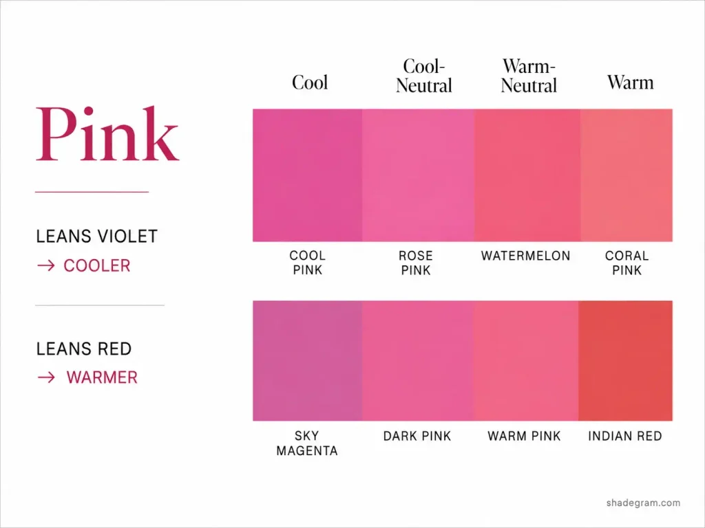
Pink sits between violet and red. Like green, it falls around the midpoint between the two temperature poles.
That gives pink a wide temperature range.
Cool pinks include fuchsia, rose, and magenta pink. Warm pinks include coral, salmon, and peach pink.
The easiest clue is usually the neighboring color you can see inside it.
Warm pinks look more reddish. Cool pinks show more violet influence.
Not Every Family Splits Evenly
The idea that every color comes in both warm and cool versions is useful, but it is not completely accurate.
Some families have a much wider temperature range than others.
| Family | Available temperature range |
|---|---|
| Red | Cool to warm |
| Orange | Warm-neutral to warm |
| Yellow | Cool-neutral to warm |
| Green | Cool to warm |
| Cyan | Cool to warm-neutral |
| Blue | Cool to cool-neutral |
| Violet | Cool to warm-neutral |
| Pink | Cool to warm |
Green and pink cover the full range most evenly because both sit around the midpoint between peak warmth and zero warmth. They have room to move in either direction.
The families with narrower ranges are limited by their position on the wheel.
Orange contains peak warmth, so it cannot become genuinely cool. Blue contains zero warmth, so it cannot become warm. Yellow sits close enough to peak warmth that it never fully cools, while violet sits close enough to zero warmth that it never fully warms.
In practice, this does not mean you have to avoid an entire family.
If your undertone is not available within that family, select the closest version it offers.
Warm coloring plus blue means choosing the cyan-leaning, cool-neutral blues. Cool coloring plus orange means choosing the less-warm oranges, such as rust or apricot.
You are not automatically excluded from the family. You are simply choosing from the end of its available temperature range.
Where Neutrals Fit
Most shades we call neutrals are highly desaturated versions of the eight color families.
Remove enough chroma from a hue and it begins to read as a neutral, but the underlying hue is still there. That means the neutral can still carry an undertone.
1. Brown, Beige, Cream, and Ivory
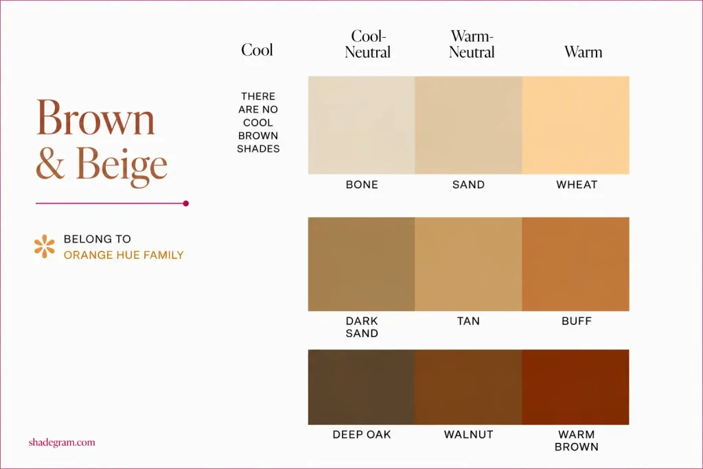
Brown, beige, cream, and ivory sit within the orange family.
Brown is essentially a desaturated orange. Beige, cream, and ivory are lighter versions within the same general family.
That means they follow orange-family temperature rules.
A brown or beige with a balanced mixture of yellow and red influence reads warmer. Move it farther toward yellow or red and it becomes less warm. Add more grey and it cools further because grey itself contributes no warmth.
Warmer examples include camel, caramel, chestnut, and sand.
Cooler examples include greige, mushroom, taupe brown, and stone.
2. Grey
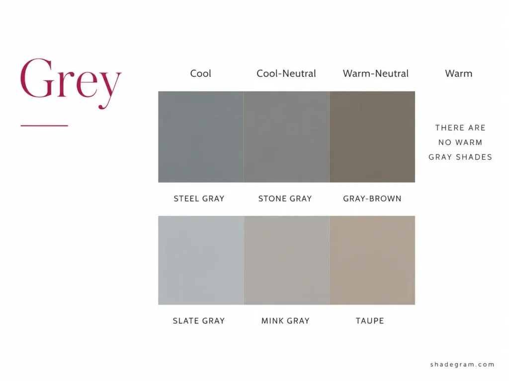
Most greys are not perfectly neutral greys.
They often carry a small amount of another hue, most commonly blue or orange.
Greys with blue influence read cooler. Steel, slate, and gunmetal are common examples.
Greys with orange influence begin moving toward brown, producing shades such as greige, taupe, and stone grey.
3. Black, White, and True Grey
Black, white, and true neutral grey are cool because they contain no warmth.
It also explains something that can sound strange at first: technically, there is no true warm white.
Ivory and cream are not warmer versions of pure white. They are extremely light, highly desaturated colors from the orange family.
That is why changing an outfit from optic white to ivory can make such a noticeable difference next to the skin.
4. Olive and Khaki
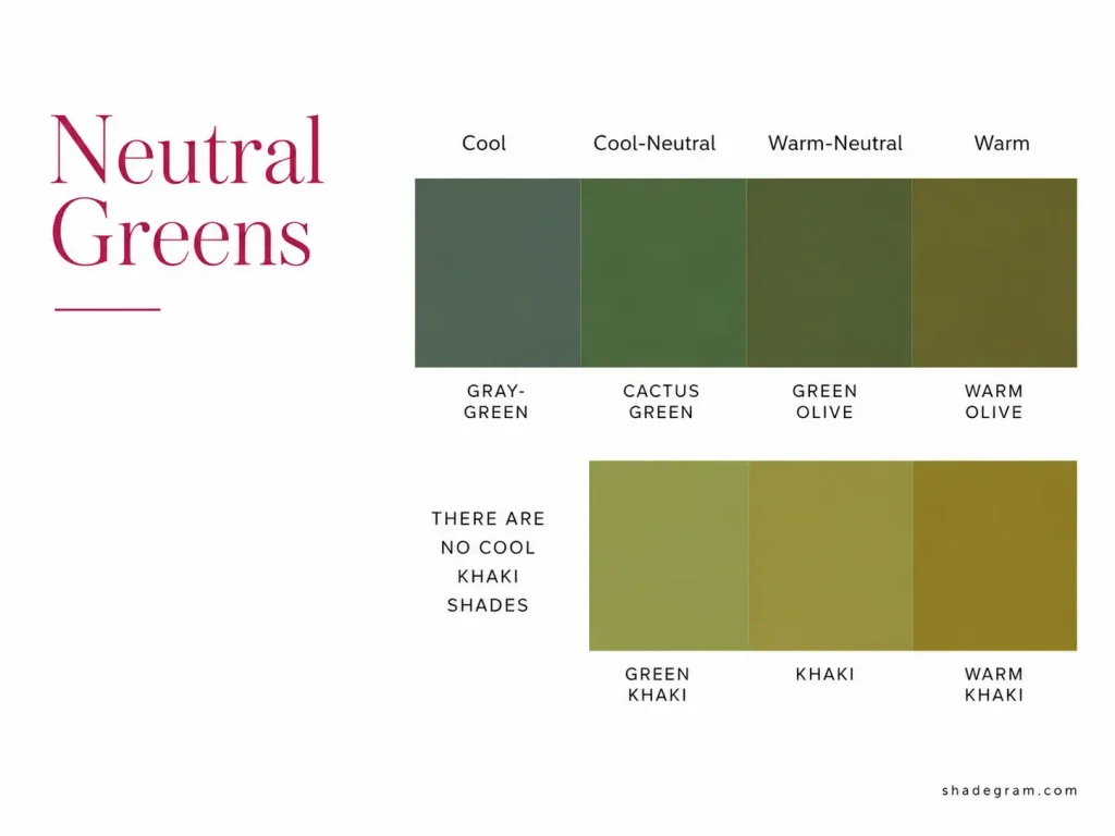
Olive and khaki often get treated as interchangeable, but they do not sit in exactly the same place.
Olive is a green. Warmer olives lean more yellow-brown. Cooler olives tend to look greyer or more blue-green.
Khaki usually sits closer to yellow. As a green becomes increasingly yellow-dominant, it can move into yellow-family territory.
That means they do not always follow exactly the same temperature rules.
It is worth checking which family the shade in front of you actually resembles instead of relying only on the name on the label.
5. Skin
Human skin also sits broadly within the orange range.
Skin color is influenced by several biological pigments and optical effects, with melanin strongly affecting depth and combinations of yellow, red, and brown influences affecting how warm or cool the skin appears.
For practical color analysis, the important point is that skin usually reads somewhere within a yellow-red-orange range rather than as a pure neutral.
It helps explain why undertone matching between skin and colors such as camel, cream, brown, or ivory can feel especially noticeable.
It also challenges one common shortcut: yellow-looking skin is not automatically warm.
Warmth is not simply the presence of yellow. Within this model, moving orange toward yellow takes it away from peak warmth. So, a yellow or olive cast in the skin should not be used on its own to decide whether someone has a warm undertone.
Undertone Is Only One Of Three Dimensions
If you have worn a color that was supposedly right for your undertone but it still looked wrong, undertone may not have been the issue.
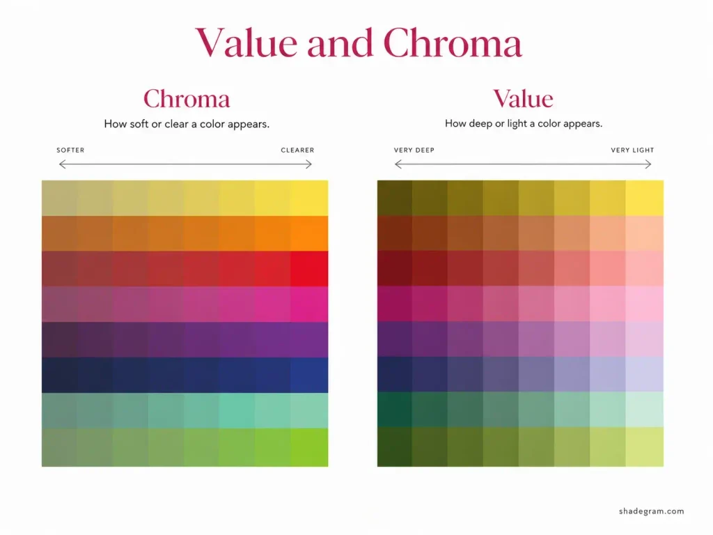
Color has three important properties, not one:
- Hue and undertone. Which family the color belongs to, and how warm or cool it is within that family.
- Value. How light or deep the color is on a scale from white to black.
- Chroma. How soft or clear the color looks. Clear colors appear more vivid and saturated. Soft colors contain more grey and look more muted.
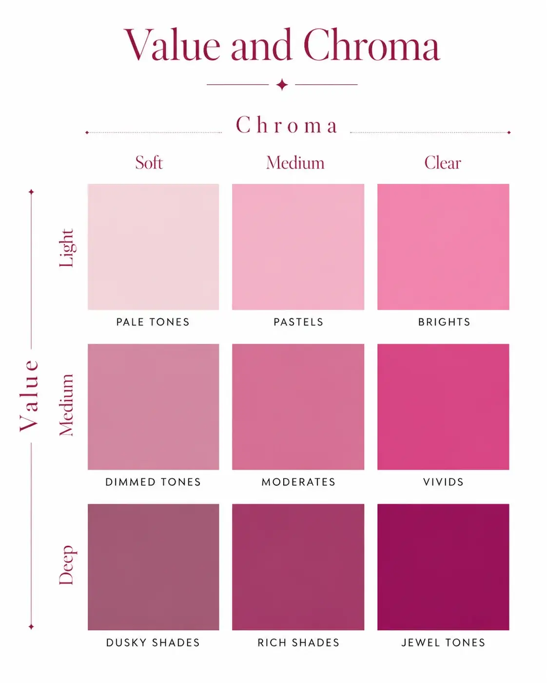
Combine value and chroma and you get nine useful categories:
| Soft chroma | Medium chroma | Clear chroma | |
|---|---|---|---|
| Light value | Pale tones | Pastels | Brights |
| Medium value | Dimmed tones | Moderates | Vivids |
| Deep value | Dusky shades | Rich shades | Jewel tones |
Two useful things come out of this grid.
First, colors can start to change identity as value and chroma shift.
Warm yellows, oranges, and greens can begin reading as browns or beiges once enough chroma is removed. That is part of why brown relates so closely to the orange family.
Yellow also effectively disappears from the jewel-tone category because once it becomes deep enough, it tends to read as brown, olive, or gold rather than a clear deep yellow.
Second, and more useful for getting dressed, matching undertone while missing the right value or chroma can still make a color feel wrong.
A cool red jewel tone and a cool red pastel are both cool reds, but they can look completely different on the same person.
Many people suit only part of the full value-and-chroma range especially well, while several nearby categories may still work reasonably well.
A Color That Is Not Yours Is Not a Hard No
Color harmony does not have to be treated as pass or fail.
It works better as a scale:
- Perfect match. Echoes your coloring closely across all three dimensions.
- Harmonious. Slightly different in one area but still works very well.
- Okay. Does not closely echo your coloring, but the difference is not strong enough to create much distraction.
- Dissonant. Does not harmonise well and may wash you out or pull attention away from your face.
- Clash. Very different from your coloring across several dimensions at once.
A shade usually becomes truly difficult when several properties are working against you at the same time.
A lot of colors that get labelled as “bad colors” actually sit somewhere in the middle.
So, if you love a shade that is not quite right for you, there are plenty of ways to wear it.
Move it farther from your face. Wear it in a smaller amount. Add something closer to your undertone near your neckline and use the less-harmonious color elsewhere in the outfit.
Color analysis is meant to help you make faster choices, not give you a list of colors you are forbidden to wear. Personal taste still matters.
How To Use This
You can apply the whole system in three steps.
1. Find Your Undertone on the Four-Point Scale
Cool, cool-neutral, warm-neutral, or warm.
Look specifically for orange warmth in the skin rather than assuming yellow means warm or pink means cool. Surface redness and flushing can easily confuse the result.
2. In Each Family, Choose the Version Closest to Your Level
You are not automatically looking for the warmest or coolest version available.
You are looking for the one that best matches your own position on the scale.
3. Adjust for Depth and Clarity
Your coloring also determines how light or deep, and how soft or clear, your best shades tend to be.
Temperature gets you part of the way there. Value and chroma finish the comparison.
Reading a Shade in a Shop
A few simple checks make this much easier in person.
1. Never judge a color on its own
Put two versions of the same family side by side.
A temperature difference that was almost invisible on its own often becomes obvious immediately once there is something to compare it with.
2. Ask which neighboring color it seems to borrow from
Is this green pulling toward cyan or toward yellow?
Is this pink pulling toward red or violet?
Is this red becoming more orange or more pink?
That neighboring influence tells you a lot about its temperature.
3. Hold it against white printer paper
Plain white paper gives you a useful near-neutral reference.
Subtle yellow, blue, red, or grey influences often become much easier to see against it.
4. Check it in daylight
Retail lighting can distort color temperature, especially when the lighting itself is warm.
Before making a final decision, check the fabric near a window or outside the strongest shop lighting if you can.
FAQ
Are all colors either warm or cool?
Not exactly. Colors sit on a spectrum from cool to warm, with cool-neutral and warm-neutral between the two.
Some families also have limited ranges. Blue does not become warm, while orange does not become truly cool.
Is black warm or cool?
Black is cool in this system because it contains no warmth. The same applies to white and true neutral grey.
What gets called a “warm black” is usually an off-black, softened black, brown-black, or another very dark color carrying a warm hue.
Is brown always warm?
No. Brown belongs broadly to the orange family and can appear warmer or cooler depending on where it sits within that range.
Balanced orange-browns tend to feel warmer. Browns moving farther toward yellow, red, or grey can become relatively cooler within the family.
What is the difference between hue and undertone?
Hue tells you which color family a shade belongs to.
Undertone tells you where that shade sits inside its family on the cool-to-warm scale.
Two colors can share the same hue family and still have very different undertones.
Can I wear a color that is not my undertone?
Yes. Color harmony works in degrees rather than as a strict yes-or-no rule.
A shade that is only slightly different from your undertone may still look very good. A color that is farther away can still work when worn farther from the face, used in smaller amounts, or paired with something closer to your coloring.
Is grey a cool color?
True neutral grey is cool because it contains no warmth. Most greys used in clothing, though, contain a slight hue.
Blue-tinted greys such as steel and slate read cooler. Greys with more orange or brown influence begin moving toward greige, taupe, and stone.