

Clear Spring is bright, warm-leaning, and full of color. It has the freshness of Spring, but it can handle much more saturation and contrast than True Spring or Light Spring.
It is also called Bright Spring. The two names usually refer to the same season in the 12-season color analysis system. Clear Spring sits close to Bright Winter, which explains why its palette can look much stronger than the soft colors people often associate with Spring.
If you are a Clear Spring, color usually needs enough intensity to keep up with you. Dusty, gray, faded shades can look flat, while coral, turquoise, clear green, sunny yellow, and strong warm reds tend to work much better.
Table of Contents
What Is Clear Spring?
Clear Spring combines Spring warmth with some of Winter’s clarity and contrast. In systems that use seasonal flow, it falls between True Spring and Bright Winter. Its dominant quality is brightness, with warmth coming second.
The basic color profile looks like this:
| Color quality | Clear Spring |
|---|---|
| Undertone | Warm-neutral |
| Value | Mostly medium, with lighter and deeper supporting colors |
| Chroma | High, clear and saturated |
| Contrast | Usually medium-high to high |
| Strongest color types | Brights, vivids and clear jewel tones |
Clear Spring is vibrant and luminous, with warm-neutral Brights, Vivids, and Jewel Tones as its strongest color groups. Clear Springs often have more natural intensity than people expect from a Spring season.
What Does a Clear Spring Look Like?
There is no single Clear Spring appearance.
You can have light, medium, deep, or very deep coloring. Hair can range from lighter warm shades to dark brown or black. Eyes may be light or dark. What matters more is how your coloring reacts to color.

The seasonal system works better when you judge color harmony rather than appearance stereotypes. People with very different skin, hair, and eye colors can belong to the same season.
Clear Spring becomes more likely when:
- saturated colors make your skin look clearer rather than overwhelmed
- warm-neutral colors tend to work better than strongly cool ones
- muted shades seem dull compared with brighter versions of the same hue
- there is noticeable contrast or clarity somewhere in your overall coloring
- warm brights work better than earthy, smoky, or heavily gray colors
A dark-haired Clear Spring is still a Clear Spring. A Clear Spring with brown eyes is still a Clear Spring. Do not rule out the season because you do not match a social media example.
Best Colors for Clear Spring
Clear Spring has one of the strongest palettes in the Spring family.
The colors can be bright without looking separate from the person wearing them. The personal color palette includes strong pinks, reds, yellows, greens, aquas, blues, and purples rather than limiting Clear Spring to peach and yellow.
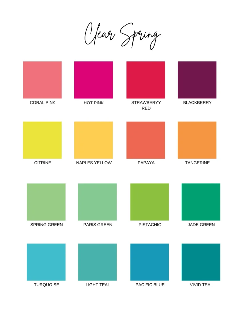
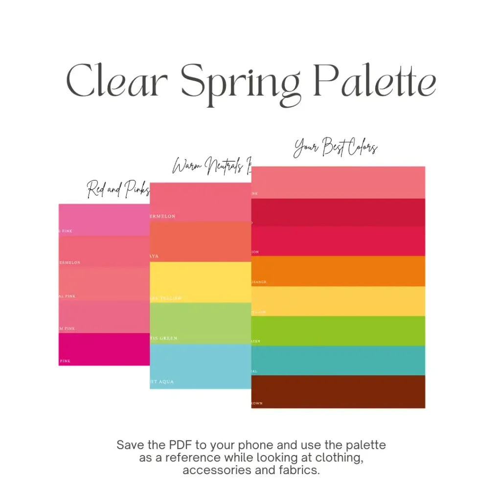
Reds and Pinks
Try:
- watermelon
- coral pink
- warm pink
- hot pink
- ruby red
- strawberry red
- tomato red
- vermilion
- crimson
- warm clear red
Warm coral and watermelon are especially easy starting points if strong red feels intimidating.
Orange and Yellow
This is a very good area for Clear Spring.
Look for:
- canary yellow
- sunny yellow
- citrine
- marigold yellow
- tangerine
- papaya
- carrot orange
Go for clear yellow or orange, not brownish mustard or heavily muted rust.
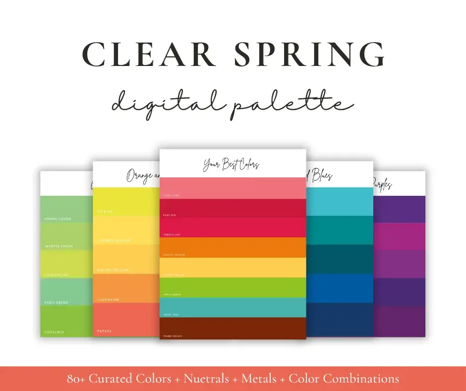
Greens
Clear Spring gets a wide range of greens:
- spring green
- apple green
- chartreuse
- leafy green
- jade green
- Kelly green
- bright fern
- emerald green
- clear dark green
Green is especially useful if you want color without relying on pink, coral, or orange.
Blues and Aquas
Spring does not mean avoiding blue.
Good options include:
- bright aqua
- turquoise
- light teal
- vivid teal
- bright azure
- clear blue
- French blue
- deep sea blue
The best blues usually have enough brightness or a slight green influence to keep them from feeling icy.
Purples
Try:
- vivid violet
- bright orchid
- warmer fuchsia
- deep violet
- clear purple
Very gray lavender and smoky plum are usually less successful.
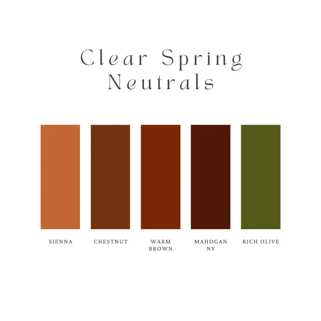
Best Neutrals for Clear Spring
Your wardrobe does not have to be bright from head to toe.
The key is choosing neutrals that do not drain all the color from an outfit.
Strong options include:
- warm ivory
- cream
- bisque
- wheat
- camel
- soft navy
- espresso
- chestnut
- warm brown
- rich olive
- midnight blue
- warm taupe
Black and stark white are not the strongest core neutrals for this season. That does not mean you need to throw them away. They simply have less connection to Clear Spring’s warmer coloring than ivory, navy, espresso, or warm brown.
Use black in shoes, bags, belts, trousers, or smaller details if you like it. Near the face, compare it directly with espresso or navy and see which one works better.
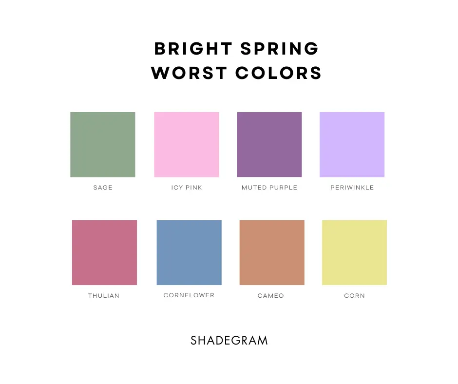
Colors That Are Usually Harder to Wear
Clear Spring loses more from grayness and softness than from color itself.
Be careful with:
- dusty rose
- smoky mauve
- muted sage
- mushroom
- cool taupe
- cloudy blue
- slate gray
- pale gray
- washed-out lavender
- ashy beige
- very faded pastels
Does Clear Spring Have to Avoid Pastels?
“Pastel” covers too many colors to make a blanket rule useful. A pastel can still have good chroma. Clear aqua, fresh pink, and bright warm yellow can work far better than a gray, chalky pastel.
The issue isn’t that a color is light. The problem is when it becomes too pale, too cool, or too muted. Clear Spring does not need every item to look neon.
Easy Clear Spring Color Combinations
You can use strong color without making every outfit complicated.
Try combinations such as:
- warm ivory + watermelon + turquoise
- soft navy + coral + canary yellow
- espresso + apple green + bright aqua
- wheat + jade green + papaya
- chestnut + tomato red + sunny yellow
For a quieter outfit, use one strong color with two Clear Spring neutrals.
For example, an espresso trouser, ivory top, and turquoise scarf still follows the palette without feeling overly colorful.
Clear Spring Makeup
Makeup should repeat the same clarity found in the clothing palette.
Foundation and Concealer
Match foundation to your actual skin.
Do not choose an overly yellow foundation simply because Clear Spring is warm-neutral. Skin depth and undertone vary too much for one seasonal foundation shade to work for everyone.
Blush
Good shades include:
- coral
- peach
- bright apricot
- warm pink
- watermelon
Muted mauve and very cool dusty pink can look flat.
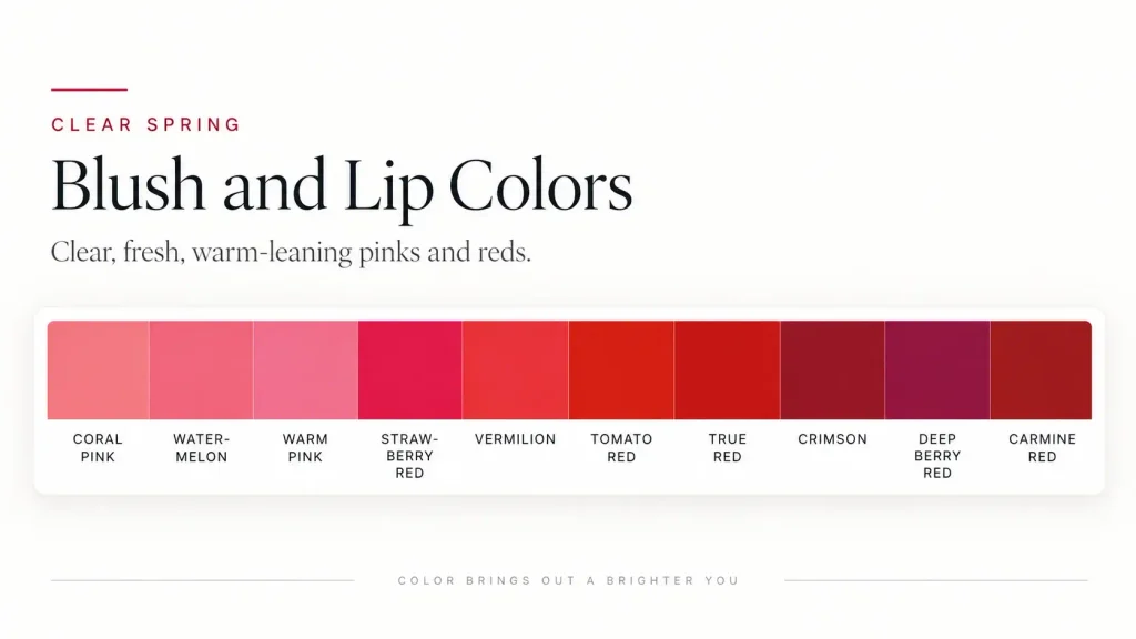
Lipstick
Clear Spring can handle much more lip color than many other Spring types.
Try:
- coral
- watermelon
- warm red
- tomato red
- bright peach-pink
- warm clear pink
Very brown nude lipstick, dusty mauve, cool berry, and deep burgundy can remove too much freshness from the face.
Eyes
Useful shades include:
- warm brown
- golden brown
- bronze
- copper
- olive
- gold
- warm teal
A brown or warm brown-black liner often works more naturally than a heavy charcoal gray.
Clear Spring Hair Color
Your season does not require a specific hair color.
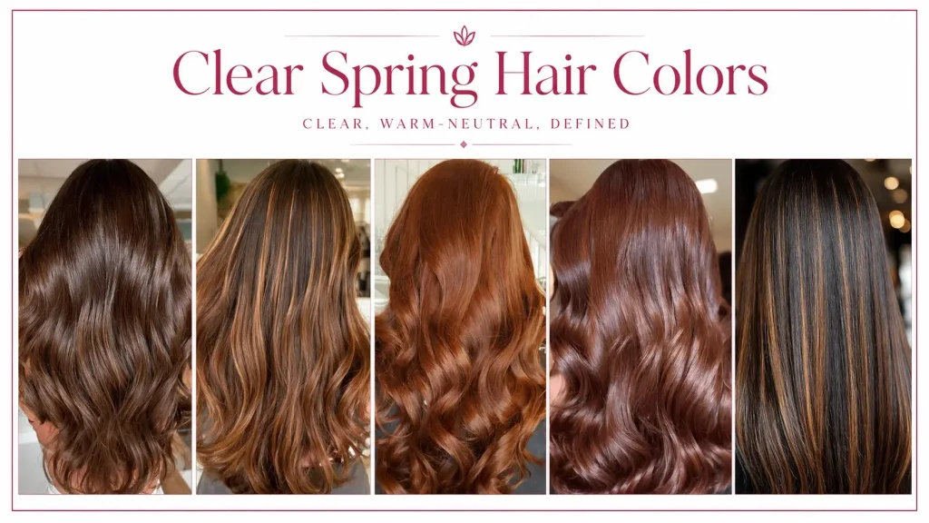
Clear Springs can naturally have medium brown, deep brown, black, red, and lighter warm hair.
If your natural color works well, there is no reason to change it just because you were typed as Clear Spring.
If you do color your hair, keeping the result close to your natural depth is usually safer than forcing a dramatic seasonal stereotype. Warm brown, golden brown, chestnut, or warm red may work when they make sense with your starting color.
Cool ash tones and platinum can be harder because they introduce a very different temperature from the Clear Spring palette.
Clear Spring does not mean you should automatically become blonde, copper, or red.
Clear Spring Jewelry
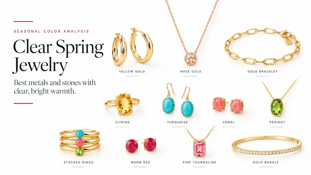
Warm yellow gold is one of the strongest metal choices for Clear Spring. Its saturation and warmth fit this season particularly well.
Also consider:
- bright yellow gold
- apricot gold
- rose gold
- copper
- polished warm metals
Silver is not automatically wrong.
The exact finish matters. Bright, reflective silver can work better than dark, oxidized, or dull silver, particularly because Clear Spring sits closer to neutral than True Spring.
For stones, look at clear versions of:
- turquoise
- citrine
- peridot
- jade
- aquamarine
- coral
- emerald
Large jewelry near your face has more impact than a small ring or fine bracelet, so there is no need to police every metal you own.
Building a Clear Spring Wardrobe
Start with a small usable palette rather than trying to buy every Clear Spring color.
A practical wardrobe could use three or four neutrals such as ivory, navy, espresso, and cognac, then add two or three main colors you actually enjoy wearing.
For example:
Neutrals: ivory, soft navy, espresso, warm brown
Main colors: turquoise, coral, apple green
Extra accent: sunny yellow
Now most pieces can mix without making the wardrobe feel repetitive.
Denim
Choose denim that still looks clear.
Medium or deeper saturated blue usually works better than heavily faded, gray, acid-washed, or distressed denim.
Prints
Clear Spring can handle stronger prints.
Look for:
- clear florals
- tropical colors
- crisp stripes
- geometric prints
- strong color blocking
- patterns with visible contrast
Very faded watercolor prints can soften the colors too much.

Clear Spring vs. True Spring
Both are Spring seasons, but their priorities are different.
True Spring is warmer. Its colors feel more golden and purely warm.
Clear Spring is brighter. It has more Winter influence, so it can handle stronger saturation, greater contrast, and some colors that sit closer to neutral.
If golden, sunny colors look best but very intense shades start taking attention away from your face, True Spring may be closer.
If slightly softer Spring colors seem weak and your face holds its own against very saturated color, Clear Spring becomes more likely.
Clear Spring vs. Bright Winter
This comparison can be harder because both seasons handle very high chroma.
The main difference is temperature.
Clear Spring leans warm-neutral. Like coral, golden yellow, apple green, turquoise, and warm red.
Bright Winter leans cool-neutral. Like electric fuchsia, cobalt, icy color, true black, and crisp white.
If warm brights consistently work better than icy brights, Clear Spring is the stronger match.
Clear Spring vs. Deep Autumn
The comparison is easy to overlook, especially with deeper skin, dark hair, or strong overall coloring.
Both seasons can have warmth and noticeable contrast. The difference is mainly chroma.
Deep Autumn handles rich, earthy, slightly muted depth.
Clear Spring handles much clearer saturation.
A useful comparison is a deep muted brown against a bright canary yellow. If the clear yellow feels natural rather than overpowering, that points more strongly toward Clear Spring.
FAQs
Is Clear Spring the same as Bright Spring?
Yes. Bright Spring and Clear Spring are commonly used for the same season. Different systems simply prefer different names.
Can Clear Spring wear black?
You can, but it does not have to be your main neutral. If black looks heavy close to your face, replace it with espresso, warm dark brown, soft navy, or another deep Clear Spring neutral. Small amounts of black are much less important than a large black top or coat beside the face.
Can Clear Spring have dark hair or dark skin?
Do not use skin depth or hair darkness to exclude Clear Spring. The season can appear across a wide range of natural coloring, and Clear Springs are sometimes mistaken for Autumn or Winter because of their depth and contrast.
Does Clear Spring have to wear extremely bright colors every day?
No. Your best palette may contain strong color, but your outfit can still be simple. Use warm-neutral basics and add one Clear Spring color where you want it.
What is the biggest Clear Spring shopping mistake?
Buying colors because they are technically warm while ignoring chroma.
A dusty warm beige and a clear warm coral can both be warm, but they behave very differently. Clear Spring usually needs enough saturation to keep the color from looking flat.
A Simple Clear Spring Shopping Rule
Check three things before buying a color:
- Is it warm or warm-neutral enough?
- Does it look clear rather than gray or dusty?
- Is the depth comfortable for your own complexion and contrast?
Two Clear Springs do not need identical wardrobes.
Someone with fair coloring may prefer the lighter end of the palette. Someone with deeper coloring may use more jewel tones and dark neutrals. The season gives you a range to work within, not a fixed uniform.
If the color keeps its clarity, works with your temperature, and looks balanced next to your face, it belongs in the conversation.