

True Spring is warm, clear, and luminous. Its colors have noticeable warmth and enough saturation to look fresh, but they do not rely on the extreme contrast or depth found in some Winter-influenced palettes.
True Spring is often reduced to “warm, bright, and light.” But the main dimensions for typing a person are undertone, hue, chroma, and contrast.
True Spring has a warm undertone, clear chroma, and low to medium contrast. Its color essence is warm and luminous, with Warm Brights and Warm Moderates as its strongest color groups.
Let’s explore it in detail!
Table of Contents
True Spring at a Glance
| Characteristic | True Spring |
|---|---|
| Undertone | Warm |
| Chroma | Clear |
| Contrast | Low to medium |
| Color essence | Warm and luminous |
| Strongest color groups | Warm Brights and Warm Moderates |
| Additional strong colors | Warm Jewel Tones for many light-medium and deeper skin tones |
| Sister seasons | Clear Spring and Light Spring |
| Least harmonious direction | Cool Dusky Shades |
| Strong metal direction | Warm yellow gold |
| Main color effect | Fresh, clear, warm color without excessive depth |
True Spring is the central Spring season. Its sister seasons are Clear Spring and Light Spring. Some systems call Clear Spring as Bright Spring, so you may see Bright Spring used online for the same category. True Spring is between Bright Spring and Light Spring and warmest part of the Spring family.
What Makes True Spring Different?
Three things matter most: warmth, clarity, and moderate visual contrast.
1. True Spring is Fully Warm
True Spring sits on the warm end of the seasonal system rather than the warm-neutral area occupied by its sister seasons.
That warmth can appear through coral, orange-red, yellow-green, golden yellow, warm brown, peach, and other colors with a clear warm direction.
Warmth does not mean you have to wear orange and yellow all the time. Blue, pink, red, green, and violet can all work. The exact version of each color matters more than its basic color name.
A turquoise can work beautifully while a smoky blue may not. A coral pink can work while a greyed mauve may feel dull. A fresh apple green and a soft sage are both green, but they behave very differently next to True Spring coloring.
2. True Spring Needs Clear Color
Clear chroma means the colors retain noticeable saturation. They are not heavily greyed, faded, or smoky.
This is where True Spring separates most clearly from Autumn.
A True Spring green tends to look fresh and colorful. An Autumn green is more likely to look earthy or subdued. A True Spring coral stays clear. An Autumn red may move toward rust, brick, or brown.
Clear does not automatically mean neon. True Spring can handle strong color, but the palette is broader than fluorescent brights.
3. True Spring is Not a High-Contrast Season
True Spring has clear chroma without the high contrast associated with Clear Spring. You can handle color intensity, but very deep color and strong dark-light contrast can become heavier than the coloring itself.
That explains why coral, papaya, apple green, and turquoise can work well while a head-to-toe combination of black and pure white may feel too severe.
What Does a True Spring Person Look Like?
There is no single True Spring face.
Hair color, eye color, skin depth, freckles, or ethnicity cannot identify a season on their own. Do not match yourself to a model or assume that one trait, such as red hair, automatically means True Spring. The whole combination of skin, hair, eyes, undertone, chroma, contrast, and luminosity matters.
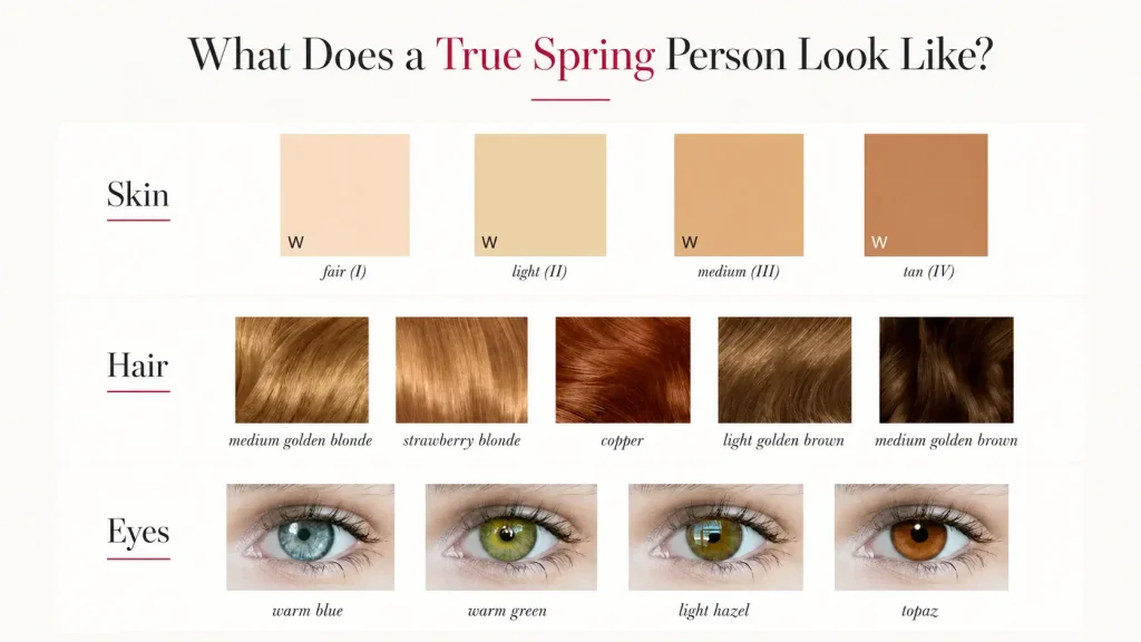
1. Skin
True Spring can occur across different skin depths.
Warmth is the important part, not if the skin is fair or deep. Skin may read golden, peachy, warm beige, warm brown, or another warm variation depending on the person’s natural pigmentation.
A fair True Spring and a deep True Spring will not necessarily wear the same depths equally well, even though both belong to the same season.
2. Hair
Possible natural hair colors include blonde, red, brown, and deeper brown.
Medium and deeper True Springs can have brown hair and brown eyes, so blonde or red hair should never be treated as a requirement.
3. Eyes
Warm blue, green, hazel, brown, and other eye colors are possible.
Eye patterns and flecks may be interesting clues, but they are not reliable enough to type someone by themselves. The response of the whole face to color matters more.
The True Spring Color Palette
The strongest True Spring colors fall into two main groups:
- Warm Brights have strong color, a warm undertone, and a lively appearance.
- Warm Moderates remain colorful but feel slightly less intense.
For True Springs with light-medium or deeper skin, Warm Jewel Tones can also be excellent because greater skin depth can support deeper colors without allowing those colors to dominate the face.
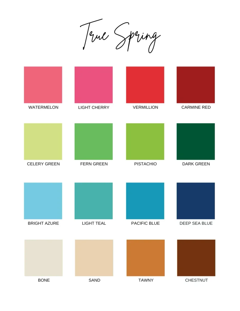
Here are the best true spring colors by family:
| Color family | Strong True Spring directions | Examples |
|---|---|---|
| Pink | Warm, clear, peachy or coral-based | Flamingo pink, salmon, watermelon, coral pink, warm pink |
| Red | Clear warm to neutral-warm reds | True red, strawberry red, vermilion, tomato red, chili red |
| Orange | Fresh and warm | Apricot, papaya, tangerine, carrot orange |
| Yellow | Clear golden and warm yellows | Mango yellow, Naples yellow, marigold yellow, mustard yellow |
| Green | Fresh yellow-green to clear green | Celery, chartreuse, fern green, pistachio, apple green, Kelly green |
| Blue | Clear aqua, cyan, turquoise and selected warmer blues | Robin’s-egg blue, bright aqua, light teal, cerulean, Pacific blue, vivid teal |
| Violet | Clearer, warmer violet directions | Warm violet and redder, clearer purples rather than greyed lavender |
| Neutrals | Warm or warm-neutral with enough clarity | Ivory, bone, ecru, oat, sand, wheat, tawny, sienna, warm brown, soft navy |
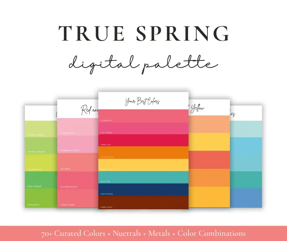
1. Reds and Pinks
True Spring has a strong red and pink range.
Good directions include coral pink, salmon, watermelon, warm pink, flamingo pink, tomato red, strawberry red, vermilion, and true red.
Greyed mauve, cool dusty pink, and smoky berry colors are much harder because they reduce the clarity True Spring needs.
2. Oranges and Yellows
Spring handles yellow and orange especially well.
Apricot, papaya, tangerine, mango yellow, marigold, carrot orange, and warm golden yellows fit naturally into the palette.
3. Greens
True Spring greens range from light yellow-greens to stronger clear greens.
Celery, chartreuse, pistachio, fern, apple green, Kelly green, and light olive are all useful directions.
Forest green is often listed as too dark for Spring, yet dark green among the Warm Jewel Tones can be excellent for light-medium and deeper True Springs. Skin depth matters.
4. Blues and Teals
Being warm does not mean avoiding blue. True Spring can wear a substantial range of cyan, aqua, turquoise, teal, and blues like robin’s-egg blue, bright azure, vivid teal, and deeper teal options for suitable skin depths. A clear aqua or turquoise usually makes more sense than a smoky slate blue.
5. True Spring Neutrals
True Spring neutrals are broader than cream and camel. Like ivory, bone, heather gray, ecru, oat, sand, cashmere, bisque, desert sand, wheat, ocher, tawny, sienna, warm brown, chestnut, russet, mahogany, espresso, soft navy, and rich olive.
Not every gray is wrong. Not every brown is right. Not every navy is too cool.
Even heather gray appears in the True Spring neutral palette. What matters is the specific gray, not the word “gray.”
Can True Spring Wear Black?
Black simply is not one of the most naturally harmonious colors near the face.
True Spring has less need for the extreme depth and contrast of pure black. Warm brown, chestnut, espresso, rich olive, or soft navy often connect more easily with the palette.
You also do not have to replace every black item you own.
Color has more impact when it is close to your face and when it covers a larger area. Black trousers, a handbag, shoes, or a belt have much less effect on facial color harmony than a black turtleneck.
If you like black, keep it. Put one of your stronger Spring colors near your face.
What About White?
Ivory, bone, and ecru usually sit more comfortably in the palette than a stark blue-white.
Pure white is not forbidden. It simply creates a cooler, sharper contrast.
What About Gray?
Choose carefully rather than rejecting the whole family.
The True Spring neutral chart includes heather gray. Warm taupe-like grays, light greiges, and warmer gray-beige mixtures may also be easier than blue charcoal.
Which Colors Are Less Harmonious?
| Harmony level | Direction |
|---|---|
| Strongest match | Warm Brights and Warm Moderates |
| Strongest match for many light-medium/deeper complexions | Warm Jewel Tones |
| Harmonious | Vivids, warm Pastels, warm-neutral colors |
| Okay | Some Rich Shades, Pale Tones, cool-neutral colors |
| Dissonant | Cool Dimmed Tones |
| Least harmonious | Cool Dusky Shades |
Warm colors are strongest, but some cool-neutral colors can still be perfectly wearable. A clear rose pink, for example, may work much better than a heavily greyed warm color.
The least helpful direction combines several mismatched qualities at once: cool, muted, and dusky.
Like smoky blue-gray, dusty mauve, muted blue-purple, or a cool faded charcoal.
Are Pastels Good for True Spring?
They are not usually the strongest part of the palette.
Spring is often associated with pastels because people connect the season with light colors. Pastels are not ideal for True Spring because many are too light to hold enough saturation. Warm Pastels can still look harmonious, but Warm Brights and Warm Moderates are stronger matches. Pale Tones are weaker again.
So, a warm peach pastel may work. A very pale, chalky peach may not. A clear coral may work even better.
True Spring Color Combinations
True Spring usually looks good with visible color contrast rather than outfits that blend into one muted block. Repeat the season’s moderate natural contrast through value contrast, hue contrast, or a bright color paired with a neutral.
Here are practical combinations using colors found within the True Spring direction:
| Color Combination | Color Combination |
|---|---|
| Coral pink + bright aqua | Ivory + coral pink + bright aqua |
| Mango yellow + apple green | Bone + mango yellow + fern green |
| Salmon + light olive | Sand + salmon + light teal |
| Tomato red + ecru | Ecru + tomato red + apple green |
| Papaya + tawny | Tawny + papaya + teal |
| Soft navy + chartreuse | Soft navy + coral + chartreuse |
| Pacific blue + wheat | Wheat + Pacific blue + warm pink |
Neutrals-only outfits can still work, but adding one clear Spring color usually makes the outfit feel more connected to the season.
Prints and Patterns
Color matters more than whether a pattern is floral, striped, geometric, or abstract.
A useful True Spring print contains mostly colors from the palette and preserves some visible contrast rather than blending into a greyed wash. Prints with enough contrast reflect the season’s clearer appearance.
If a print contains one less-than-ideal color in a small amount, that does not automatically make the whole garment unsuitable.
Look at the print from normal viewing distance. Ask if the overall effect is warm, clear, and lively or cool, muted, and heavy.
Jewelry and Metals
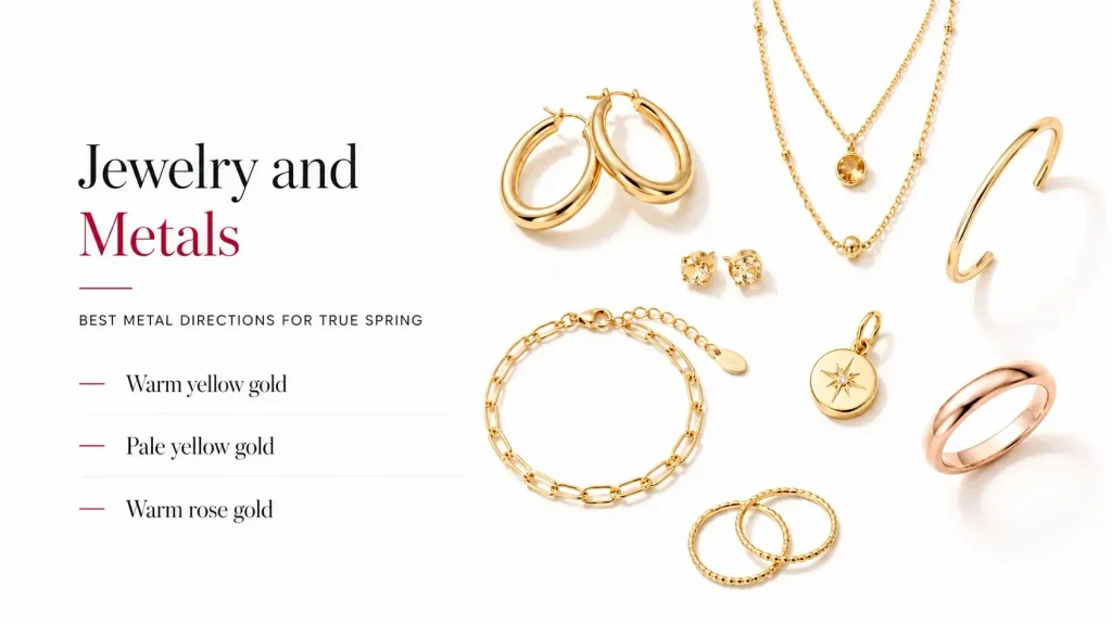
Warm yellow gold is one of the strongest metal directions for True Spring.
It has the warmth and saturation that fit the palette particularly well. Pale yellow gold also works well. Apricot gold is another strong Spring option, and warm rose gold can work because it sits in a warm-neutral range.
Small jewelry has limited effect on overall color harmony because its color dosage is small. A large silver statement necklace close to the face matters much more than a thin silver ring.
Very dark oxidized silver is less successful because it combines coolness with deep, dusky coloring.
True Spring Makeup
Makeup should follow the same color relationships as clothing, but there is another factor to consider: intensity.
Foundation and Concealer
Do not choose foundation from a seasonal palette.
Foundation has to match your actual skin in both depth and undertone. A warm label may be a useful starting point for True Spring skin, but makeup brands do not define “warm,” “neutral,” and “olive” in exactly the same way.
The foundation should disappear into your skin, not look like a True Spring swatch.
Warm skin generally starts with warm foundation shades. But brand undertone labels vary. Foundation and concealer have to be matched to the individual skin rather than prescribed by season.
Blush
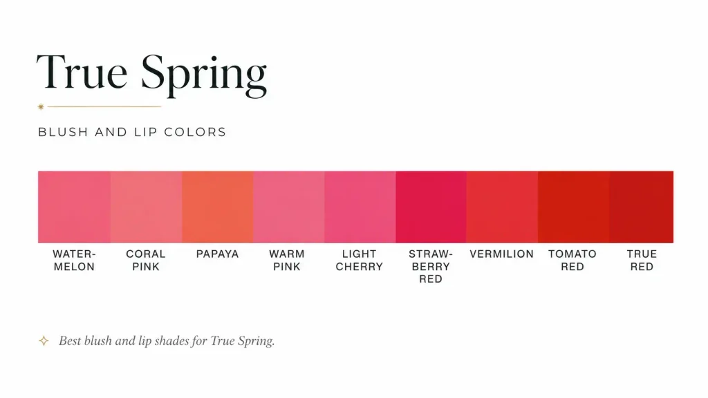
Good directions include peach, salmon, coral, apricot, and warm pink.
The exact depth should match your skin. A blush suitable for a fair True Spring may disappear on a deeper True Spring, while a deeper coral may be too strong on someone very fair.
Lip Colors
Start with the True Spring red and pink palette:
coral, salmon, warm pink, watermelon, tomato red, strawberry red, warm true red, and similar clear warm shades.
Opacity changes intensity. A sheer tomato lip is much softer than the same color in a fully opaque formula.
Eyeshadow and Liner
Useful directions include warm beige, gold, peach, warm brown, olive, teal, and colors drawn directly from the palette.
Very smoky gray, charcoal, and icy silver can add more coolness and depth than True Spring needs.
Brown, warm navy, olive, or teal liner can define the eyes without automatically creating the starkness of black.
How Much Makeup Works?
True Spring does not require heavy makeup simply because its palette contains saturated colors.
Makeup intensity should follow the person’s own contrast.
Medium-contrast coloring can handle noticeable definition and color, but very deep eye makeup and strong opaque color across several parts of the face may become too much. Lower-contrast True Springs generally need a lighter hand. Opacity, depth, and the amount of the face covered all affect intensity.
True Spring Hair Color
Your natural hair color is already harmonious with your coloring.
That includes natural gray hair.
Untreated natural hair already belongs with the rest of your coloring, so you do not need to change it to make yourself “more Spring.”
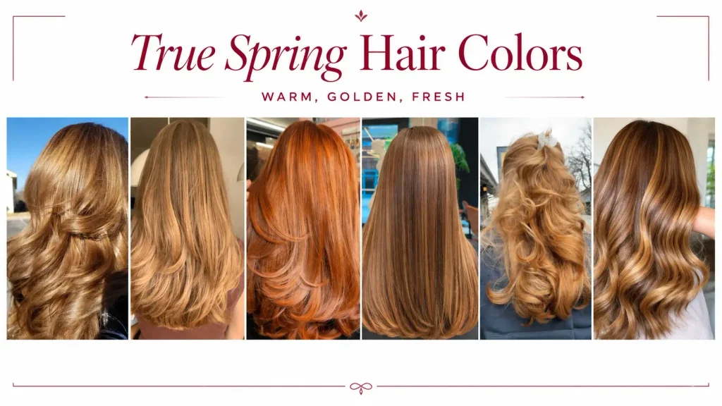
If you choose to color your hair, both level and tone matter.
Golden blonde, honey, copper, warm red, caramel, golden brown, and warm brown directions may make sense depending on your starting color and natural contrast. Do not force toward blonde or copper.
A deep-haired True Spring may look completely natural in deeper warm brown. Lightening that hair several levels simply because Spring is associated with lightness can reduce the person’s natural contrast.
Ashy, heavily blue-based, or extremely cool tones are usually harder because they move away from True Spring’s warm direction.
Building a True Spring Wardrobe
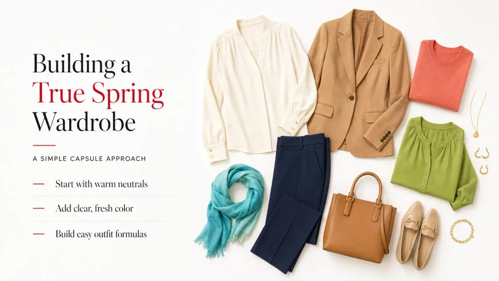
You can build a useful wardrobe without filling it with orange, coral, and yellow.
Start with neutrals, then add clear color.
A practical base can include warm ivory, camel, soft navy, warm brown, and sand, with coral, turquoise, green, and golden yellow added as stronger colors.
A simple capsule could use ivory and sand for lighter basics, soft navy and warm brown for depth, coral and salmon around the face, teal or aqua for blue, and apple or fern green for variety.
Denim
Denim does not have to be a perfect seasonal match.
Medium blue, clear lighter blue, warmer indigo, and teal-leaning denim are easy options. Very greyed denim or blue-black denim may be less harmonious near the face, but jeans have limited facial impact because of their distance from the face.
Wear the denim you like and use your stronger colors on tops, jackets, scarves, or other pieces closer to your face.
Shoes, Bags, and Belts
These are good places to use colors outside your strongest palette because they have little effect on the complexion.
Warm tan, cognac, caramel, brown, cream, olive, gold, coral, and teal all fit easily, but there is no reason to remove a black bag or cool-colored shoe you already enjoy.
True Spring vs. Clear or Bright Spring
These two seasons share clear chroma, which is why they can be confused.
True Spring is more fully warm and has less contrast.
Clear Spring, often called Bright Spring in other systems, is warm-neutral and can carry stronger contrast and more intensity. True Spring’s sister relationship with Clear Spring explains why some colors can overlap.
If very bright, sharper, slightly cooler Spring colors look better than strongly warm colors, Clear or Bright Spring becomes more likely.
True Spring vs. Light Spring
Light Spring is softer and more neutral-warm.
Its palette includes more Pastels and gentler colors, while True Spring can use stronger saturation and more obvious warmth.
This is why someone who looks best in coral, papaya, apple green, and stronger warm color may be closer to True Spring, while someone who needs lighter and softer versions may fit Light Spring better.
True Spring vs. True Autumn
Both seasons are strongly warm.
The main difference is clarity.
True Spring stays clearer and fresher. True Autumn moves toward richer, softer, earthier color. True Spring is warm and bright while True Autumn shares the warmth but is more muted.
Compare coral with rust, apple green with moss, or clear turquoise with a more muted petrol shade.
If the clearer colors consistently support your face better, Spring is more likely.
True Spring vs. Soft Autumn
This pairing causes particular confusion because both can have warm coloring and moderate contrast.
The main difference is clear versus soft chroma. True Spring needs clearer color. Soft Autumn needs more muted color.
A useful comparison is a clearer warm pink against a dusky gray-green. If the soft, greyed green feels heavy but the clearer pink looks balanced, that supports True Spring.
How to Check True Spring with Draping
Physical traits can narrow the possibilities, but color response is more useful than eye color, hair color, or a jewelry test alone.
Use indirect natural daylight and remove makeup before testing. Compare several fabrics near the face rather than making a decision from a single “good” color.
Watch the skin, not the fabric.
A more harmonious color may make the skin appear more even and keep attention on the face. A less harmonious one may make shadows, discoloration, or the color itself become more noticeable.
Light olive and papaya colors should work well, coral and tawny as stronger colors the person should still be able to carry, and deep steel blue as a shade that should not be among the best.
Test whether the full combination of warmth, clarity, and contrast fits you.

Does True Spring Change with Age?
Your season does not normally switch simply because you get older or your hair turns gray.
Your best part of the palette can shift.
Chroma and contrast may reduce somewhat with age. For True Spring, this can mean the strongest Brights become slightly less ideal while some Pastels become easier to wear. Warm-neutral colors may also become more useful.
So keep testing the palette against your current coloring rather than assuming the exact same shades will remain equally strong forever.
Does Tanning Change the Palette?
A tan does not create a new season.
It can change which depths and intensities within your existing palette feel strongest.
For fair or light True Springs, a significant tan can make warmer shades easier to carry. Tanning can increase visible chroma, making more vivid colors work better for some people.
A Simple True Spring Shopping Rule
Instead of memorizing dozens of names, check three things.
- Is the color warm enough for you?
- Is it clear enough, or has too much gray been added?
- Is the depth comfortable for your own complexion and contrast?
Two True Springs can share a season without having identical best colors. A fair True Spring and a deeper True Spring may use different ends of the same palette.
The palette is a range, not one fixed set of swatches that every True Spring has to wear in exactly the same way.
Final Thoughts
True Spring is best understood as warm, clear, and luminous coloring with less contrast than Clear Spring.
Its strongest colors are not limited to peach and coral. The palette can include true red, mustard yellow, apple green, forest green for suitable skin depths, turquoise, teal, soft navy, warm brown, and even carefully chosen gray.
Warm Brights and Warm Moderates are the core. Pastels can work, but they are not automatically better because this is a Spring season. Cool-neutral colors are not automatically bad. Black is not forbidden. Silver does not have to leave your jewelry box.
Color analysis is simply a way to understand which color relationships repeat your natural coloring. Personal preference still matters more than following a palette perfectly.